Text Animate
An explanation of how the TextAnimate component works: from split-rendering typography to parent-child stagger orchestration and built-in spring animation presets.
An explanation of how the TextAnimate component works: from split-rendering typography to parent-child stagger orchestration and built-in spring animation presets.
[!NOTE] This component is referenced from the Magic UI Text Animate.

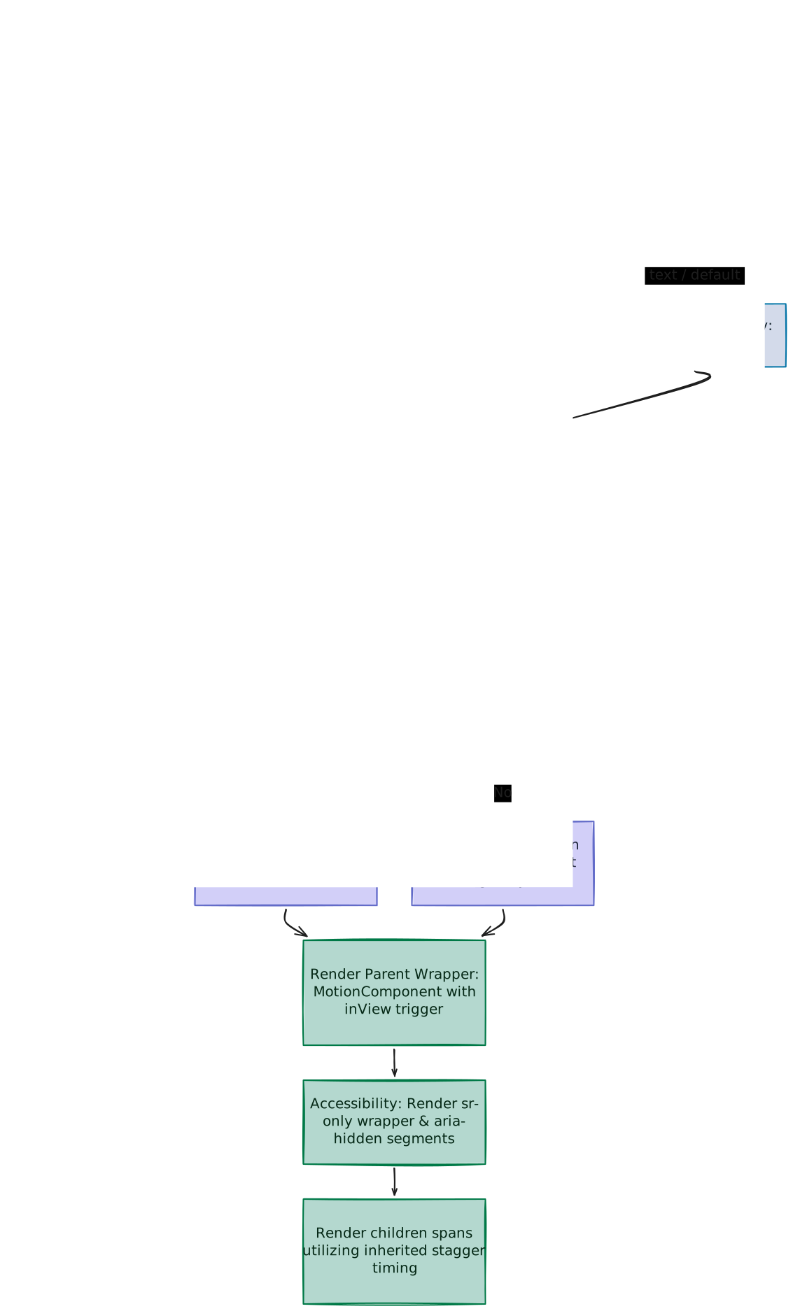
1. High-Level Flow Chart
The diagram below maps out the architecture of the TextAnimate component. It traces how the raw children text is split, how the stagger timing calculations are computed, how variants are selected/merged, and how the HTML DOM structure is rendered with screen-reader accessibility:
2. Component Implementation (text-animate.tsx)
Below is the complete implementation of the TextAnimate component using Framer Motion (motion/react):
"use client"

import { memo } from "react"
import {
  AnimatePresence,
  motion,
  type DOMMotionComponents,
  type MotionProps,
  type Variants,
} from "motion/react"

import { cn } from "@/lib/utils"

type AnimationType = "text" | "word" | "character" | "line"
type AnimationVariant =
  | "fadeIn"
  | "blurIn"
  | "blurInUp"
  | "blurInDown"
  | "slideUp"
  | "slideDown"
  | "slideLeft"
  | "slideRight"
  | "scaleUp"
  | "scaleDown"

const motionElements = {
  article: motion.article,
  div: motion.div,
  h1: motion.h1,
  h2: motion.h2,
  h3: motion.h3,
  h4: motion.h4,
  h5: motion.h5,
  h6: motion.h6,
  li: motion.li,
  p: motion.p,
  section: motion.section,
  span: motion.span,
} as const

type MotionElementType = Extract<
  keyof DOMMotionComponents,
  keyof typeof motionElements
>

interface TextAnimateProps extends Omit<MotionProps, "children"> {
  /**
   * The text content to animate
   */
  children: string
  /**
   * The class name to be applied to the component
   */
  className?: string
  /**
   * The class name to be applied to each segment
   */
  segmentClassName?: string
  /**
   * The delay before the animation starts
   */
  delay?: number
  /**
   * The duration of the animation
   */
  duration?: number
  /**
   * Custom motion variants for the animation
   */
  variants?: Variants
  /**
   * The element type to render
   */
  as?: MotionElementType
  /**
   * How to split the text ("text", "word", "character")
   */
  by?: AnimationType
  /**
   * Whether to start animation when component enters viewport
   */
  startOnView?: boolean
  /**
   * Whether to animate only once
   */
  once?: boolean
  /**
   * The animation preset to use
   */
  animation?: AnimationVariant
  /**
   * Whether to enable accessibility features (default: true)
   */
  accessible?: boolean
}

const defaultContainerVariants = {
  hidden: { opacity: 1 },
  show: {
    opacity: 1,
    transition: {
      delayChildren: 0,
      staggerChildren: 0.05,
    },
  },
  exit: {
    opacity: 0,
    transition: {
      staggerChildren: 0.05,
      staggerDirection: -1,
    },
  },
}

const defaultItemVariants: Variants = {
  hidden: { opacity: 0 },
  show: {
    opacity: 1,
  },
  exit: {
    opacity: 0,
  },
}

const defaultItemAnimationVariants: Record<
  AnimationVariant,
  { container: Variants; item: Variants }
> = {
  fadeIn: {
    container: defaultContainerVariants,
    item: {
      hidden: { opacity: 0, y: 20 },
      show: {
        opacity: 1,
        y: 0,
        transition: {
          duration: 0.3,
        },
      },
      exit: {
        opacity: 0,
        y: 20,
        transition: { duration: 0.3 },
      },
    },
  },
  blurIn: {
    container: defaultContainerVariants,
    item: {
      hidden: { opacity: 0, filter: "blur(10px)" },
      show: {
        opacity: 1,
        filter: "blur(0px)",
        transition: {
          duration: 0.3,
        },
      },
      exit: {
        opacity: 0,
        filter: "blur(10px)",
        transition: { duration: 0.3 },
      },
    },
  },
  blurInUp: {
    container: defaultContainerVariants,
    item: {
      hidden: { opacity: 0, filter: "blur(10px)", y: 20 },
      show: {
        opacity: 1,
        filter: "blur(0px)",
        y: 0,
        transition: {
          y: { duration: 0.3 },
          opacity: { duration: 0.4 },
          filter: { duration: 0.3 },
        },
      },
      exit: {
        opacity: 0,
        filter: "blur(10px)",
        y: 20,
        transition: {
          y: { duration: 0.3 },
          opacity: { duration: 0.4 },
          filter: { duration: 0.3 },
        },
      },
    },
  },
  blurInDown: {
    container: defaultContainerVariants,
    item: {
      hidden: { opacity: 0, filter: "blur(10px)", y: -20 },
      show: {
        opacity: 1,
        filter: "blur(0px)",
        y: 0,
        transition: {
          y: { duration: 0.3 },
          opacity: { duration: 0.4 },
          filter: { duration: 0.3 },
        },
      },
    },
  },
  slideUp: {
    container: defaultContainerVariants,
    item: {
      hidden: { y: 20, opacity: 0 },
      show: {
        y: 0,
        opacity: 1,
        transition: {
          duration: 0.3,
        },
      },
      exit: {
        y: -20,
        opacity: 0,
        transition: {
          duration: 0.3,
        },
      },
    },
  },
  slideDown: {
    container: defaultContainerVariants,
    item: {
      hidden: { y: -20, opacity: 0 },
      show: {
        y: 0,
        opacity: 1,
        transition: { duration: 0.3 },
      },
      exit: {
        y: 20,
        opacity: 0,
        transition: { duration: 0.3 },
      },
    },
  },
  slideLeft: {
    container: defaultContainerVariants,
    item: {
      hidden: { x: 20, opacity: 0 },
      show: {
        x: 0,
        opacity: 1,
        transition: { duration: 0.3 },
      },
      exit: {
        x: -20,
        opacity: 0,
        transition: { duration: 0.3 },
      },
    },
  },
  slideRight: {
    container: defaultContainerVariants,
    item: {
      hidden: { x: -20, opacity: 0 },
      show: {
        x: 0,
        opacity: 1,
        transition: { duration: 0.3 },
      },
      exit: {
        x: 20,
        opacity: 0,
        transition: { duration: 0.3 },
      },
    },
  },
  scaleUp: {
    container: defaultContainerVariants,
    item: {
      hidden: { scale: 0.5, opacity: 0 },
      show: {
        scale: 1,
        opacity: 1,
        transition: {
          duration: 0.3,
          scale: {
            type: "spring",
            damping: 15,
            stiffness: 300,
          },
        },
      },
      exit: {
        scale: 0.5,
        opacity: 0,
        transition: { duration: 0.3 },
      },
    },
  },
  scaleDown: {
    container: defaultContainerVariants,
    item: {
      hidden: { scale: 1.5, opacity: 0 },
      show: {
        scale: 1,
        opacity: 1,
        transition: {
          duration: 0.3,
          scale: {
            type: "spring",
            damping: 15,
            stiffness: 300,
          },
        },
      },
      exit: {
        scale: 1.5,
        opacity: 0,
        transition: { duration: 0.3 },
      },
    },
  },
}

const TextAnimateBase = ({
  children,
  delay = 0,
  duration = 0.3,
  variants,
  className,
  segmentClassName,
  as: Component = "p",
  startOnView = true,
  once = false,
  by = "word",
  animation = "fadeIn",
  accessible = true,
  ...props
}: TextAnimateProps) => {
  const MotionComponent = motionElements[Component]

  let segments: string[] = []
  switch (by) {
    case "word":
      segments = children.split(/(\s+)/)
      break
    case "character":
      segments = children.split("")
      break
    case "line":
      segments = children.split("\n")
      break
    case "text":
    default:
      segments = [children]
      break
  }

  const finalVariants = variants
    ? {
      container: {
        hidden: { opacity: 0 },
        show: {
          opacity: 1,
          transition: {
            opacity: { duration: 0.01, delay },
            delayChildren: delay,
            staggerChildren: duration / segments.length,
          },
        },
        exit: {
          opacity: 0,
          transition: {
            staggerChildren: duration / segments.length,
            staggerDirection: -1,
          },
        },
      },
      item: variants,
    }
    : animation
      ? {
        container: {
          ...defaultItemAnimationVariants[animation].container,
          show: {
            ...defaultItemAnimationVariants[animation].container.show,
            transition: {
              delayChildren: delay,
              staggerChildren: duration / segments.length,
            },
          },
          exit: {
            ...defaultItemAnimationVariants[animation].container.exit,
            transition: {
              staggerChildren: duration / segments.length,
              staggerDirection: -1,
            },
          },
        },
        item: defaultItemAnimationVariants[animation].item,
      }
      : { container: defaultContainerVariants, item: defaultItemVariants }

  return (
    <AnimatePresence mode="popLayout">
      <MotionComponent
        variants={finalVariants.container as Variants}
        initial="hidden"
        whileInView={startOnView ? "show" : undefined}
        animate={startOnView ? undefined : "show"}
        exit="exit"
        className={cn("whitespace-pre-wrap", className)}
        viewport={{ once }}
        aria-label={accessible ? children : undefined}
        {...props}
      >
        {accessible && <span className="sr-only">{children}</span>}
        {segments.map((segment, i) => (
          <motion.span
            key={`${by}-${segment}-${i}`}
            variants={finalVariants.item}
            className={cn(
              by === "line" ? "block" : "inline-block whitespace-pre",
              segmentClassName
            )}
            aria-hidden={accessible ? true : undefined}
          >
            {segment}
          </motion.span>
        ))}
      </MotionComponent>
    </AnimatePresence>
  )
}

export const TextAnimate = memo(TextAnimateBase)
3. Segment Splitting Logic (by)
Before animating, TextAnimate must decompose its raw text string into a list of animatable segments. This partitioning is dictated by the by prop:
let segments: string[] = []
switch (by) {
  case "word":
    segments = children.split(/(\s+)/)
    break
  case "character":
    segments = children.split("")
    break
  case "line":
    segments = children.split("\n")
    break
  case "text":
  default:
    segments = [children]
    break
}
Explaining the Split Mechanics
word: Split via/(\s+)/. By capturing the whitespace characters inside parenthesis, JavaScript'ssplitretains them as separate segments in the returned array. This ensures spacing is preserved natively without collapsing.character: Split via""(empty string). This splits the text character-by-character, allowing granular, wave-like stagger sweeps.line: Split via"\n"(newline). Perfect for block-level transitions where sentences or whole paragraphs enter together.text& Switch Fall-through: Groupingcase "text"anddefaultwithout abreakfalls through tosegments = [children], rendering the text as a single segment and serving as a fallback for invalid inputs.
4. Parent-Child Orchestration & Delay Math
Dynamic text layouts containing varying character counts require responsive animation pacing. Setting static offsets causes sentences of different lengths to render unevenly.
TextAnimate resolves this by calculating stagger parameters programmatically inside the parent container variant:
staggerChildren: duration / segments.lengthThe Timing Math
Without dynamic scaling, a 100-character sentence takes 20 times longer to finish than a 5-character word. To prevent this, the delay between segments scales dynamically:
staggerChildren = duration / segments.lengthFor example, with a duration of 0.5s and a transition time of 0.3s:
- 5 Segments: Stagger delay is
0.10s(0.5 / 5). The last segment starts at0.40s(visual total:0.70s). - 50 Segments: Stagger delay drops to
0.01s(0.5 / 50). The last segment starts at0.49s(visual total:0.79s).
This keeps the overall entrance timeframe consistent (~0.7s – 0.8s) regardless of text length.
Exit Ordering (staggerDirection)
To animate elements away cleanly, the parent specifies:
staggerDirection: -1This reverses the traversal order inside Framer Motion's stagger scheduler. When unmounted or toggled, the animation rolls backward from the last character/word to the first.
5. Built-in Animation Presets Gallery
Here is the isolated variant configuration code, visual state progression, and behavioral analysis for each of the 10 built-in presets:
1. fadeIn (Fade & Slide Up)
const fadeInVariants = {
  container: defaultContainerVariants,
  item: {
    hidden: { opacity: 0, y: 20 },
    show: {
      opacity: 1,
      y: 0,
      transition: { duration: 0.3 },
    },
    exit: {
      opacity: 0,
      y: 20,
      transition: { duration: 0.3 },
    },
  },
}- Hidden State: Starts fully transparent (
opacity: 0) and shifted 20px down (y: 20). - Show State: Arrives at full opacity (
1) and resting position (y: 0) over0.3s. - Exit State: Returns down the exact way it came, fading to transparent at
y: 20. - Visual Feel: A classic, soft vertical fade and lift.
2. blurIn (Focus Reveal)
const blurInVariants = {
  container: defaultContainerVariants,
  item: {
    hidden: { opacity: 0, filter: "blur(10px)" },
    show: {
      opacity: 1,
      filter: "blur(0px)",
      transition: { duration: 0.3 },
    },
    exit: {
      opacity: 0,
      filter: "blur(10px)",
      transition: { duration: 0.3 },
    },
  },
}- Hidden State: Fully transparent with a heavy Gaussian blur filter (
blur(10px)). - Show State: Becomes sharp (
blur(0px)) and visible over0.3s. - Exit State: Fades out while blurring back to
10px. - Visual Feel: Mimics a camera lens snapping into a sharp focal plane.
3. blurInUp (Focus & Rise)
const blurInUpVariants = {
  container: defaultContainerVariants,
  item: {
    hidden: { opacity: 0, filter: "blur(10px)", y: 20 },
    show: {
      opacity: 1,
      filter: "blur(0px)",
      y: 0,
      transition: {
        y: { duration: 0.3 },
        opacity: { duration: 0.4 },
        filter: { duration: 0.3 },
      },
    },
    exit: {
      opacity: 0,
      filter: "blur(10px)",
      y: 20,
      transition: {
        y: { duration: 0.3 },
        opacity: { duration: 0.4 },
        filter: { duration: 0.3 },
      },
    },
  },
}- Hidden State: Transparent, blurred (
blur(10px)), and offset downward (y: 20). - Show State: Emerges smoothly. The vertical placement and blur transitions take
0.3s, while the opacity fade is stretched slightly to0.4sfor a softer blend. - Exit State: Reverses all transition speeds and offsets downwards.
- Visual Feel: A premium focus reveal combined with an upward float.
4. blurInDown (Focus & Fall)
const blurInDownVariants = {
  container: defaultContainerVariants,
  item: {
    hidden: { opacity: 0, filter: "blur(10px)", y: -20 },
    show: {
      opacity: 1,
      filter: "blur(0px)",
      y: 0,
      transition: {
        y: { duration: 0.3 },
        opacity: { duration: 0.4 },
        filter: { duration: 0.3 },
      },
    },
  },
}- Hidden State: Transparent, blurred (
blur(10px)), and offset upward (y: -20). - Show State: Blurs away while dropping from above into resting alignment
y: 0. - Exit State: Uses default exit settings (since no overrides are specified).
- Visual Feel: Gravity-driven focal entry.
5. slideUp (Infinite Directional Slide Up)
const slideUpVariants = {
  container: defaultContainerVariants,
  item: {
    hidden: { y: 20, opacity: 0 },
    show: {
      y: 0,
      opacity: 1,
      transition: { duration: 0.3 },
    },
    exit: {
      y: -20,
      opacity: 0,
      transition: { duration: 0.3 },
    },
  },
}- Hidden State: Starts below resting line (
y: 20) with no opacity. - Show State: Slides up into resting structure (
y: 0). - Exit State: Continues moving upward (
y: -20) while fading out. - Visual Feel: Continual upward current.
6. slideDown (Infinite Directional Slide Down)
const slideDownVariants = {
  container: defaultContainerVariants,
  item: {
    hidden: { y: -20, opacity: 0 },
    show: {
      y: 0,
      opacity: 1,
      transition: { duration: 0.3 },
    },
    exit: {
      y: 20,
      opacity: 0,
      transition: { duration: 0.3 },
    },
  },
}- Hidden State: Suspended above (
y: -20), transparent. - Show State: Slides downward to baseline.
- Exit State: Exits downward through the floor (
y: 20) as it fades. - Visual Feel: Downward conveyor feed.
7. slideLeft (Directional Slide Left)
const slideLeftVariants = {
  container: defaultContainerVariants,
  item: {
    hidden: { x: 20, opacity: 0 },
    show: {
      x: 0,
      opacity: 1,
      transition: { duration: 0.3 },
    },
    exit: {
      x: -20,
      opacity: 0,
      transition: { duration: 0.3 },
    },
  },
}- Hidden State: Offset to the right (
x: 20), transparent. - Show State: Slides leftward into layout position.
- Exit State: Continues sliding leftward (
x: -20), fading out. - Visual Feel: Horizontal flow from right to left.
8. slideRight (Directional Slide Right)
const slideRightVariants = {
  container: defaultContainerVariants,
  item: {
    hidden: { x: -20, opacity: 0 },
    show: {
      x: 0,
      opacity: 1,
      transition: { duration: 0.3 },
    },
    exit: {
      x: 20,
      opacity: 0,
      transition: { duration: 0.3 },
    },
  },
}- Hidden State: Offset to the left (
x: -20), transparent. - Show State: Slides rightward into position.
- Exit State: Continues sliding rightward (
x: 20), fading out. - Visual Feel: Horizontal flow from left to right.
9. scaleUp (Spring Pop)
const scaleUpVariants = {
  container: defaultContainerVariants,
  item: {
    hidden: { scale: 0.5, opacity: 0 },
    show: {
      scale: 1,
      opacity: 1,
      transition: {
        duration: 0.3,
        scale: {
          type: "spring",
          damping: 15,
          stiffness: 300,
        },
      },
    },
    exit: {
      scale: 0.5,
      opacity: 0,
      transition: { duration: 0.3 },
    },
  },
}- Hidden State: Shrunk to half its normal scale (
0.5), invisible. - Show State: Fades in while scaling to full size. The scaling behavior is driven by spring physics variables:
- Stiffness (
300): Creates high acceleration during structural recovery. - Damping (
15): Suppresses oscillations quickly, producing a crisp settling bounce.
- Stiffness (
- Exit State: Shrinks back down to
0.5over0.3s. - Visual Feel: Bouncy, organic entry pop.
10. scaleDown (Spring Drop)
const scaleDownVariants = {
  container: defaultContainerVariants,
  item: {
    hidden: { scale: 1.5, opacity: 0 },
    show: {
      scale: 1,
      opacity: 1,
      transition: {
        duration: 0.3,
        scale: {
          type: "spring",
          damping: 15,
          stiffness: 300,
        },
      },
    },
    exit: {
      scale: 1.5,
      opacity: 0,
      transition: { duration: 0.3 },
    },
  },
}- Hidden State: Scaled up to
1.5(large foreground state), transparent. - Show State: Drops downward onto normal dimensions using identical spring mechanics.
- Exit State: Zooms forward back to
1.5while fading. - Visual Feel: A heavy "impact/drop" entry from the foreground.
Comparing fadeIn vs. slideUp
While fadeIn and slideUp share an identical entry animation (moving from y: 20 to y: 0 while transitioning opacity), they behave differently on exit.
fadeIn(Reversing flow): Fades out while resetting toy: 20(retreating down the way it came).slideUp(Continuous flow): Fades out while continuing toy: -20(exiting off-screen upwards).
6. Custom Animation Variants & Visibility Mechanics
Developers can pass custom Framer Motion overrides via the variants prop. To handle this path safely, the component implements specific visibility controls:
const finalVariants = variants
  ? {
      container: {
        hidden: { opacity: 0 },
        show: {
          opacity: 1,
          transition: {
            opacity: { duration: 0.01, delay },
            delayChildren: delay,
            staggerChildren: duration / segments.length,
          },
        },
        exit: {
          opacity: 0,
          transition: {
            staggerChildren: duration / segments.length,
            staggerDirection: -1,
          },
        },
      },
      item: variants,
    }
  : // ... preset animations path
Explaining the Container Custom Opacity Snap & Delay Orchestration
When animating built-in presets, the component does not hide the parent container since preset item configurations guarantee that all child segments start at opacity: 0.
However, when a developer provides custom variants (which might omit opacity controls or target other properties like y or scale), the rendering engine must handle visibility and entry delays safely:
- Preventing Visual Flashing: Custom variants might render text fully visible on initial paint prior to JS hydration. Launching with parent
hidden: { opacity: 0 }keeps the entire block hidden. - Instant Opacity Snapping: During the
showtransition, the parent's opacity snaps to1in exactly 10ms (duration: 0.01). This instant reveal prevents a slow parent fade from compound-overlapping the children's individual animations (avoiding a muddy "double-fade" effect). - Synchronized Delay Orchestration: Binding the component's
delayparameter to both the parent's snap (opacity: { delay }) and its children (delayChildren: delay) ensures that the entire animation sequence pauses synchronously. The text remains completely invisible and static until the delay period has completed.
7. Under the Hood: Layout & Accessibility (A11y)
Dynamic Tag Resolution
To ensure semantic markup, TextAnimate dynamically resolves the parent HTML tag via the as prop:
const motionElements = {
  article: motion.article,
  div: motion.div,
  h1: motion.h1,
  // ... other header, list, and section elements
} as const
Assigning as="h1" resolves the element to motion.h1 on render, preserving paragraph structures, heading trees, and semantic accessibility.
CSS Layout Rules
Text segment wrappers require specific layout rules:
- Line splitting (
by="line"): Each line is rendered with theblockCSS class, directing the browser to stack each sentence onto a new row. - Word/Character splitting (
by="word" | "character"): Rendered asinline-block whitespace-pre.inline-blockallows letters and words to flow naturally next to one another. (Standardinlinespans do not support layout offset transforms likeyandscaleat all in CSS / Framer Motion).whitespace-prepreserves spaces between tags, preventing the browser from collapsing consecutive whitespace characters.
Accessibility (A11y) Implementation
Splitting sentences into dozens of separate elements causes screen readers to announce each word or letter in fragmented blocks. TextAnimate avoids this by splitting the visual representation from the accessible representation when accessible is enabled:
- Accessible Name: The parent element receives
aria-label={children}to provide the complete, unfragmented sentence label. - Visually Hidden Copy: A full copy of the plain text is printed inside a hidden span:
<span className="sr-only">{children}</span>sr-onlykeeps the text invisible to standard users but readable for screen readers. - Muted Visuals: The individual animated spans are hidden from assistive technologies:
aria-hidden={accessible ? true : undefined}
8. Memoization & Export Optimization
Before exporting, TextAnimateBase is wrapped in React's memo utility:
export const TextAnimate = memo(TextAnimateBase)Wrapping the component in memo prevents redundant re-rendering and text-splitting operations when the parent component re-renders with unchanged props.
9. Properties Reference
| Property | Type | Default | Description |
|---|---|---|---|
children | string | Required | The raw text copy to animate. |
className | string | undefined | CSS class name applied to the parent element container. |
segmentClassName | string | undefined | CSS class name applied to each individual animated segment span. |
delay | number | 0 | Delay in seconds before the animation sequence begins. |
duration | number | 0.3 | Target duration in seconds of the stagger sequence loop. |
variants | Variants | undefined | Custom Framer Motion variants to override built-in options. |
as | MotionElementType | "p" | Underling HTML element tag to render. |
by | "text" | "word" | "character" | "line" | "word" | Granularity used to split and animate the text. |
startOnView | boolean | true | When true, animates only when the element enters the viewport. |
once | boolean | false | When true, viewport trigger animations run only once. |
animation | AnimationVariant | "fadeIn" | Predefined animation preset structure to apply. |
accessible | boolean | true | Activates inline a11y screen-reader visibility helpers. |