Border Beam
A deep dive into CSS masking, offset paths, and motion keyframes combined to animate a glowing border effect.
Implementation breakdown of the BorderBeam component, covering its transparent border geometry, dual-layered masking interpolation, and hardware-accelerated CSS motion paths.
[!NOTE] This component is referenced from the Magic UI Border Beam.
1. High-Level Flow Chart
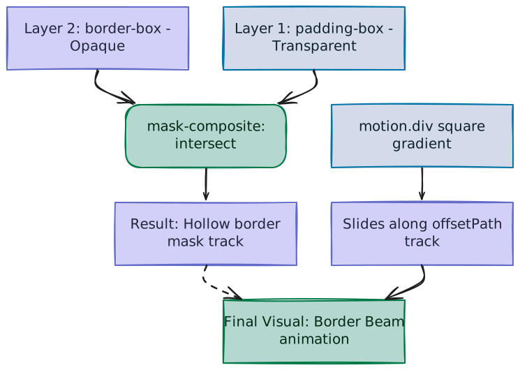
The diagram below details the compositing pipeline and motion trajectory calculations that coordinate a moving gradient square into a sharp, border-contained animated beam:
2. High-Level Overview
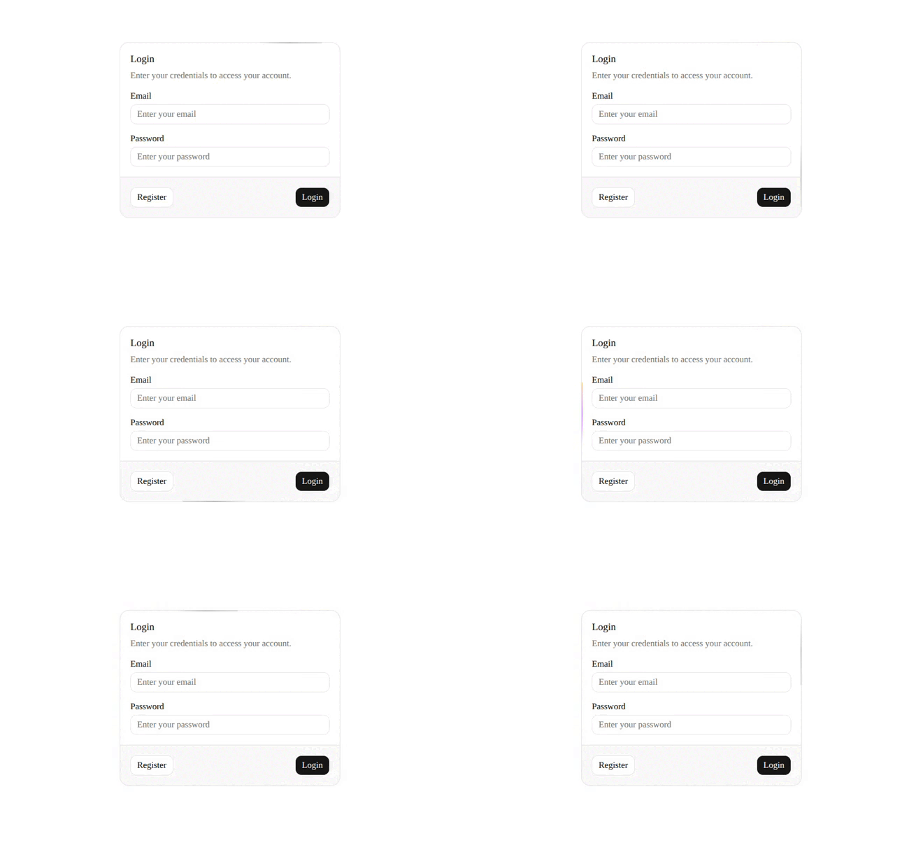
The BorderBeam component renders a glowing gradient beam that travels seamlessly around a container's border. Rather than rendering a complex SVG path or tracking container coordinates manually, it achieves the effect using native browser rendering rules and CSS magic:
- Dual Mask Composition: Combines a larger outer box mask and a smaller inner box mask to produce a hollow border-shaped visibility window.
- Native CSS Motion Paths (
offsetPath): Binds the animated gradient shape to a rectangular trail automatically shaped to match the parent container's dimensions. - GPU-Accelerated Motion: Moves a static gradient shape along the path using the GPU.
3. Component Implementation (border-beam.tsx)
Below is the complete implementation of the BorderBeam component using React and Framer Motion:
"use client"

import { motion, MotionStyle, Transition } from "motion/react"

import { cn } from "@/lib/utils"

interface BorderBeamProps {
  /**
   * The size of the border beam.
   */
  size?: number
  /**
   * The duration of the border beam.
   */
  duration?: number
  /**
   * The delay of the border beam.
   */
  delay?: number
  /**
   * The color of the border beam from.
   */
  colorFrom?: string
  /**
   * The color of the border beam to.
   */
  colorTo?: string
  /**
   * The motion transition of the border beam.
   */
  transition?: Transition
  /**
   * The class name of the border beam.
   */
  className?: string
  /**
   * The style of the border beam.
   */
  style?: React.CSSProperties
  /**
   * Whether to reverse the animation direction.
   */
  reverse?: boolean
  /**
   * The initial offset position (0-100).
   */
  initialOffset?: number
  /**
   * The border width of the beam.
   */
  borderWidth?: number
}

export const BorderBeam = ({
  className,
  size = 50,
  delay = 0,
  duration = 6,
  colorFrom = "#ffaa40",
  colorTo = "#9c40ff",
  transition,
  style,
  reverse = false,
  initialOffset = 0,
  borderWidth = 1,
}: BorderBeamProps) => {
  return (
    <div
      className="pointer-events-none absolute inset-0 rounded-[inherit] border-(length:--border-beam-width) border-transparent mask-[linear-gradient(transparent,transparent),linear-gradient(#000,#000)] mask-intersect [mask-clip:padding-box,border-box]"
      style={
        {
          "--border-beam-width": `${borderWidth}px`,
        } as React.CSSProperties
      }
    >
      <motion.div
        className={cn(
          "absolute aspect-square",
          "bg-linear-to-l from-(--color-from) via-(--color-to) to-transparent",
          className
        )}
        style={
          {
            width: size,
            offsetPath: `rect(0 auto auto 0 round ${size}px)`,
            "--color-from": colorFrom,
            "--color-to": colorTo,
            ...style,
          } as MotionStyle
        }
        initial={{ offsetDistance: `${initialOffset}%` }}
        animate={{
          offsetDistance: reverse
            ? [`${100 - initialOffset}%`, `${-initialOffset}%`]
            : [`${initialOffset}%`, `${100 + initialOffset}%`],
        }}
        transition={{
          repeat: Infinity,
          ease: "linear",
          duration,
          delay: -delay,
          ...transition,
        }}
      />
    </div>
  )
}
4. The Core Architecture & CSS Masking
CSS masking controls the transparency of an element. It determines what parts of a component are visible based on opacity values (the alpha channel):
- Opaque pixels (alpha = 1): Keep the corresponding parts of the masked element visible.
- Transparent pixels (alpha = 0): Hide the corresponding parts of the masked element.
A. The Mask Composition Syntax
The Tailwind classes in our component compile down to this highly structured browser masking rule:
/* Standard CSS Rules */
mask-image: linear-gradient(transparent, transparent), linear-gradient(#000, #000);
mask-clip: padding-box, border-box;
mask-composite: intersect;

/* WebKit Legacy (Safari Support) */
-webkit-mask-composite: source-in;mask-imageDual Layers: Applies two masking layers. Layer 1 is completely transparent, and Layer 2 is a solid black container.mask-clipTarget Boundaries: Maps the transparent layer to thepadding-box(inner core container extending to the border's inner boundary) and the solid layer to theborder-box(entire card including border widths).mask-intersect/mask-composite: intersectlogic: Overlays components and calculates intersections:- Overlapping areas inside the inner container evaluate to transparent.
- Border track areas (where only the outer solid mask exists) retain 100% opacity.
                  Final Mask Shape
                +------------------+
                |██████████████████|  <--- Border Region: Opaque Black (Visible)
                |██+------------+██|
                |██|Transparent |██|  <--- Center Content Area: Clear/Hollow (Hidden)
                |██|            |██|
                |██+------------+██|
                |██████████████████|
                +------------------+
B. How the Mask Regions Work
To target the border, the mask splits the container area into two regions:
- Inside the Card (Middle Area):
- Layer 1 (transparent) and Layer 2 (solid) overlap.
- Combining them makes the card's center completely transparent (hidden).
- On the Border Track:
- Only Layer 2 (solid) exists here because Layer 1 is clipped to the padding-box.
- This leaves the thin border track visible.
This creates a hollow border track window. The component configures padding-box offset thickness using Tailwind 4's dynamic border width class border-(length:--border-beam-width) mapped to border-transparent color, letting only the moving gradient child beam show through.
C. Visualizing the Masking Effect
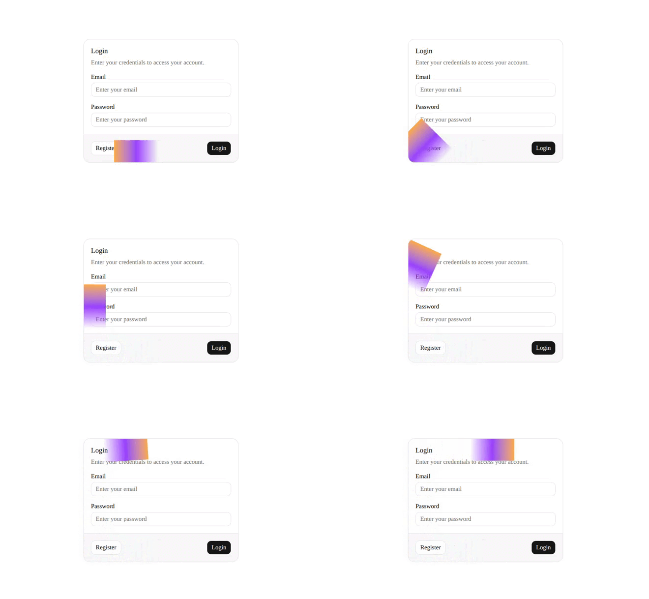
To see the impact of the masking logic, compare the final result against the unmasked beam. Without the dual-mask clipping, the component simply renders a large, aspect-square gradient sliding along the border path:
5. CSS Motion Path Mechanics (offsetPath)
Rather than relying on tedious manual coordinate calculations or static SVG files, the component uses modern browser-native Motion Paths:
offsetPath: `rect(0 auto auto 0 round ${size}px)`- The Track (
offsetPath): Binds the child element to a path (in this case, a rounded rectangle) computed dynamically by the browser. - Rectangle Boundaries (
0 auto auto 0): Coordinates the path corners (top, right, bottom, left) to lock directly onto the parent container:top: 0andleft: 0align the top-left start to the box boundaries.right: autoandbottom: autoautomatically stretch the path width and height to align perfectly with the parent container's box model as it expands or shrinks.
- Corner Fillet (
round size px): Rounds path joints to prevent sharp 90-degree angle snaps, enabling the gradient to glide smoothly around corners.
The moving gradient element is restricted in physical dimensions via aspect-square and width: size. When animating the percentage-based distance offsetDistance from 0% to 100%, it loops around the card, acting like a tiny train moving on tracks:
        0% (Start) ──────────────────►  25%
           ┌───────────────────────────────┐
         ▲ │                               │ │
         │ │                               │ ▼
         │ │             CARD              │
         │ │                               │ │
         │ └───────────────────────────────┘ ▼
         75% ◄────────────────────────────── 50%
6. Motion Interpolation and Delay Tricks
Framer Motion coordinates active loops, custom offsets, and organic staging:
A. Reverse Direction Math
To animate counter-clockwise, the component maps path progress backward when the reverse flag matches true:
- Clockwise Path:
[initialOffset%, 100 + initialOffset%] - Counter-Clockwise Path:
[100 - initialOffset%, -initialOffset%]
For example, when initialOffset = 20, reversing is computed as [80%, -20%]. Because -20% is geometrically equivalent to 80% on a closed loop, the reset is completely invisible, creating a seamless, infinite loop.
B. Pre-Warmed Animation Staggering
Passing a standard delay (e.g. delay = 2) pauses animations on mounting. By passing a negative delay instead (delay: -delay):
- Warmed Start: The browser starts the animation immediately but advances it to a point in the loop matching the delay.
- Staggered Beams: Animates sibling card beams at different progress positions along the loop, preventing them from moving in robotic synchronization.
7. Customizable Properties Reference
| Property | Default | Type | Description |
|---|---|---|---|
size | 50 | number | Width/height footprint of the square gradient beam in pixels. |
duration | 6 | number | Cycle time in seconds for a full loop around the perimeter. |
delay | 0 | number | Negated start offset (in seconds) to pre-warm the loop. |
colorFrom | "#ffaa40" | string | The starting/glow color of the gradient trail. |
colorTo | "#9c40ff" | string | The ending/fade color of the gradient trail. |
borderWidth | 1 | number | Visual width of the hollow border track. |
initialOffset | 0 | number | Location on the path (0-100%) to start the animation loop. |
reverse | false | boolean | Reverses direction to cycle counter-clockwise. |