Blur Fade
An explanation of how the BlurFade component works: from viewport scroll tracking to coordinate mathematics and rendering performance.
An explanation of how the BlurFade component works: from viewport scroll tracking to coordinate mathematics and rendering performance.
[!NOTE] This component is referenced from the Magic UI Blur Fade.

1. High-Level Flow Chart
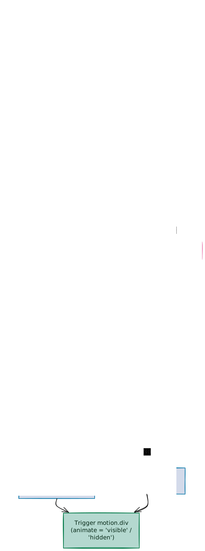
The diagram below details the lifecycle, scroll detection logic, variants configuration, and dynamic transition injection pipeline:
2. Scroll Detection & Viewport Margin
The component is configured to support both immediate mount animations and scroll-triggered animations depending on the inView prop.
const inViewResult = useInView(ref, { once: true, margin: inViewMargin });
const isInView = !inView || inViewResult;
Viewport Boundary Logic (inViewMargin)
The trigger margin defaults to "-50px". This corresponds directly to browser IntersectionObserver margins, shifting detection boundaries inwards by 50px:
- At the top of the screen, the trigger line is shifted 50px down.
- At the bottom of the screen, the trigger line is shifted 50px up.
This prevents entry animations from firing the exact millisecond the item touches the bottom edge of the screen, ensuring they trigger only when the element is far enough into the viewport to be noticed. Setting { once: true } keeps elements in their resting state after the animate loop triggers, preventing redundant animation cycles on subsequent scrolls.
Deciding When to Animate
The boolean definition of isInView uses a short-circuit expression:
const isInView = !inView || inViewResult;- Viewport Bypassed (
inView = false): Evaluates astrue || inViewResult. In JavaScript, this short-circuits totrueinstantly, triggering the animation on component mount. - Viewport Enabled (
inView = true): Evaluates asfalse || inViewResult. The expression is bound entirely to the scroll detector, maintaininghiddenuntil the element crosses the50pxentry zone.
3. Dynamic Coordinate Axis Resolution
To position slide directions dynamically (emerging from up, down, left, or right), the component indexes displacement coordinates on the fly.
const defaultVariants: Variants = {
  hidden: {
    [direction === "left" || direction === "right" ? "x" : "y"]:
      direction === "right" || direction === "down" ? -offset : offset,
    opacity: 0,
    filter: `blur(${blur})`,
  },
  visible: {
    [direction === "left" || direction === "right" ? "x" : "y"]: 0,
    opacity: 1,
    filter: `blur(0px)`,
  },
};
CSS Coordinate Polarization
y: 0maps to the element's natural layout position.- Decreasing
y(negative values like-offset) shifts the coordinates upwards. - Increasing
y(positive values likeoffset) shifts them downwards.
Thus, for direction = "down", starting with a negative y coordinate (top displacement) allows the element to slide downward into its resting center.
4. ES6 Computed Property Names
The bracket notation [expression] creates object keys on the fly:
[direction === "left" || direction === "right" ? "x" : "y"]Why brackets are required:
In JavaScript, an object key must normally be a plain letter/word or a string. If you try to write a dynamic expression directly as a key:
{
  direction === "left" || direction === "right" ? "x" : "y" : offset
}
The interpreter gets confused by the multiple colons (:) and throws a syntax error. Wrapping the expression in square brackets [expression] tells JavaScript to run the logic inside the brackets first, and use the result ("x" or "y") as the key name.
5. CSS Filter Transition Optimization & Browser Fixes
CSS transitions on filter: blur(...) can trigger browser bugs and performance lag. The component solves this by adjusting animations on the fly.
A. Fixing Firefox Animation Skipping
In some browsers (especially Firefox), animating blurs at the same time as sliding movements can cause the blur transition to break, instantly snapping the blur to 0px instead of fading it out smoothly.
Specifying a direct transition duration for the filter:
filter: { duration }forces the browser to animate the blur smoothly frame-by-frame.
B. Preventing Spring Jitter & Empty Cycles
Framer Motion uses bouncy spring physics for layout movements by default. Bouncing a CSS blur filter back and forth looks glitchy (jittery) because browsers cannot render bouncy blur states smoothly. Setting a fixed duration keeps the filter transition linear and clean.
Additionally, if the variants do not animate the filter (or if filters are identical), we check:
const shouldTransitionFilter =
  hiddenFilter != null &&
  visibleFilter != null &&
  hiddenFilter !== visibleFilter;
If this is false, the filter is skipped completely via ...{}, preventing Framer Motion from running empty style calculation loops.
6. Typing Flexibility
The component types the variant prop using Framer Motion's official Variants interface:
variant?: VariantsThis gives developers the freedom to override the default entrance settings with custom animations (like scale, rotate, or opacity) safety-checked by TypeScript.
7. Customizable Properties Reference
| Property | Type | Default | Description |
|---|---|---|---|
children | React.ReactNode | — | The content elements wrapper. |
className | string | undefined | Custom styling selectors. |
duration | number | 0.4 | Animation duration in seconds. |
delay | number | 0 | Delay offset in seconds. |
offset | number | 6 | Axis travel distance (px). |
direction | "up" | "down" | "left" | "right" | "down" | Shift entrance origin. |
inView | boolean | false | Enable scroll detection triggers. |
inViewMargin | string | "-50px" | Scroll viewport boundary margins. |
blur | string | "6px" | Initial maximum blur state. |
Shine Border
A deep dive into CSS mask composites, padding-based boundary offsets, and giant radial gradients generating glowing shine animations.
Text Animate
An explanation of how the TextAnimate component works: from split-rendering typography to parent-child stagger orchestration and built-in spring animation presets.