Infinite Marquee
A guide to CSS keyframe offsets, track replication, and seamless looping calculations for an infinite marquee.
Implementation breakdown of the Marquee component, covering its structural wrapper composition, track replication logic, and the mathematical formula required to prevent visual loop stutters.
[!NOTE] This component is referenced from the Magic UI Marquee.
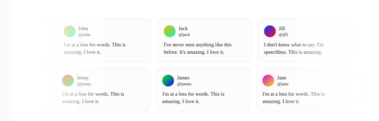
1. High-Level Overview
An infinite marquee creates the illusion of continuous scrolling content by moving an inner track of items across a masked viewport. To achieve this effect cleanly:
- Viewport Masking: The parent container sets
overflow-hiddenand defines the display layout boundaries (horizontal or vertical configuration). - Track Replication: Rather than rendering just a single set of items, the component replicates the tracks multiple times side-by-side using the
repeatproperty (defaulting to 4 times). - Linear Translation: A CSS translation moves all replicated tracks continuously at the same speed.
- Seamless Reset: When the animation cycle finishes, the tracks reset instantly to their initial coordinates (
0px). The reset must happen at a coordinates offset where the replicated track aligns pixel-for-pixel with the starting track's original coordinates.
2. Component Implementation (marquee.tsx)
Below is the complete implementation of the Marquee component:
import { type ComponentPropsWithoutRef } from "react"
import { cn } from "@/lib/utils"

interface MarqueeProps extends ComponentPropsWithoutRef<"div"> {
  /**
   * Optional CSS class name to apply custom styles
   */
  className?: string;
  /**
   * Whether to reverse the animation direction
   * @default false
   */
  reverse?: boolean;
  /**
   * Whether to pause the animation on hover
   * @default false
   */
  pauseOnHover?: boolean;
  /**
   * Content to be displayed in the marquee
   */
  children: React.ReactNode;
  /**
   * Whether to animate vertically instead of horizontally
   * @default false
   */
  vertical?: boolean;
  /**
   * Number of times to repeat the content
   * @default 4
   */
  repeat?: number;
}

export function Marquee({
  className,
  reverse = false,
  pauseOnHover = false,
  children,
  vertical = false,
  repeat = 4,
  ...props
}: MarqueeProps) {
  return (
    <div
      {...props}
      className={cn(
        "group flex gap-(--gap) overflow-hidden p-2 [--duration:40s] [--gap:1rem]",
        {
          "flex-row": !vertical,
          "flex-col": vertical,
        },
        className
      )}
    >
      {Array(repeat)
         .fill(0)
         .map((_, i) => (
           <div
             key={i}
             className={cn("flex shrink-0 justify-around gap-(--gap)", {
               "animate-marquee flex-row": !vertical,
               "animate-marquee-vertical flex-col": vertical,
               "group-hover:[animation-play-state:paused]": pauseOnHover,
               "[animation-direction:reverse]": reverse,
             })}
           >
             {children}
           </div>
         ))}
    </div>
  )
}
3. CSS Keyframes and Animation Configuration
The infinite motion is driven directly by native CSS keyframe loops defined in globals.css:
@theme inline {
  --animate-marquee: marquee var(--duration) infinite linear;
  --animate-marquee-vertical: marquee-vertical var(--duration) linear infinite;

  @keyframes marquee {
    from {
      transform: translateX(0);
    }
    to {
      transform: translateX(calc(-100% - var(--gap)));
    }
  }

  @keyframes marquee-vertical {
    from {
      transform: translateY(0);
    }
    to {
      transform: translateY(calc(-100% - var(--gap)));
    }
  }
}shrink-0: Replicated tracks must not shrink to fit the parent container. Settingshrink-0ensures that elements retain their full intrinsic width (or height), enabling calculations to remain mathematically consistent.var(--duration): Driven by a customizable CSS custom property (defaulting to40s) allowing developers to dynamically speed up or slow down the scrolling speed per component class.[animation-play-state:paused]: WhenpauseOnHoveris enabled, reaching the hovered state appliespausedto the element's play state, stopping the timeline smoothly.
Customizable Properties Reference
| Property | Default | Type | Description |
|---|---|---|---|
className | undefined | string | Optional custom classes to style the container wrapper. |
reverse | false | boolean | Reverses the scroll direction using [animation-direction:reverse]. |
pauseOnHover | false | boolean | Pauses the keyframe timeline on hover. |
vertical | false | boolean | Switches layout stack direction and scrolls vertically instead of horizontally. |
repeat | 4 | number | The number of times to clone elements to ensure the mask is always filled. |
4. The Mathematics of the Infinite Loop
The central secret to a seamless loop matches a classic movie projection reel: replacing identical frames in the exact same coordinates so that the eye cannot detect the reset.
A. The Setup Environment
- Let W be the exact physical width of a single replicated Track.
- Let G be the width of the gap between tracks (
var(--gap), e.g.,16px). - Replicated tracks sit side-by-side:
- Track 1: Placed at offset
0. - Track 2: Placed at offset
W + G.
- Track 1: Placed at offset
The initial layout starts with duplicate tracks placed side by side, offset by the gap size:

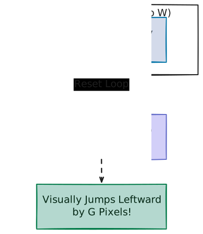
B. Case A: Shifting by exactly -100% (With Jumps)
If the animation translates leftwards by exactly own width (-100% or -W):
- At translation end (
translateX(-W)):- Track 2 is translated left by
W. - The new starting position of Track 2 becomes:
Position(Track 2) = (W + G) - W = G - Since
G > 0(e.g.16px), Track 2 is still offset to the right by the gap width.
- Track 2 is translated left by
- At loop reset (
translateX(0)):- The animation instantly resets to
0, causing Track 1 to jump to0. - Because
0 !== G, the elements visually "jump" leftward by exactlyGpixels. The user notices a periodic stutter.
- The animation instantly resets to
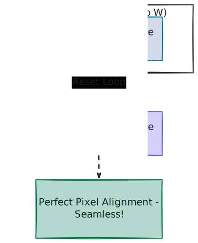
C. Case B: Shifting by -100% - gap (Perfect Seamless Loop)
To prevent the stutter, we must shift leftwards by the track width AND the gap width (-100% - G, or calc(-100% - var(--gap))):
- At translation end (
translateX(-W - G)):- Track 2 is translated left by
W + G. - The new starting position of Track 2 becomes:
Position(Track 2) = (W + G) - (W + G) = 0 - Track 2 aligns mathematically perfect at coordinate
0px—exactly where Track 1 started.
- Track 2 is translated left by
- At loop reset (
translateX(0)):- The animation resets back to
0, pulling Track 1 back to coordinate0px. - Since both Track 1 and Track 2 contain the exact same identical cards in the exact same order, the visual layout at the end of the translation is identical to the layout at the beginning. The transition is completely seamless.
- The animation resets back to
D. Extension to the Vertical Axis
When the vertical property is enabled, the layout dynamically switches to CSS columns (flex-direction: column).
The infinite scrolling logic behaves identically but translates along the Y-axis:
- Let H be the physical height of a single replicated Track.
- The translation utilizes:
translateY(calc(-100% - var(--gap))) - At the cycle end coordinate (
-H - G), the top of Track 2 reaches the coordinate0px(the container's top boundary), aligning exactly with Track 1's starting point and ensuring a seamless vertical loop reset.