Scroll Progress
An in-depth breakdown of scroll progress indicators, GPU transformation layers (scaleX), viewport coordinates, and TypeScript prop safety.
Implementation breakdown of the ScrollProgress component, covering its GPU-accelerated scaling, viewport anchoring, performance optimization to prevent reflows, and TypeScript property handling.
[!NOTE] This component is inspired by the Magic UI Scroll Progress and utilizes Framer Motion (
motion/react) and Tailwind CSS to create a lightweight, high-performance visual scroll indicator fixed to the viewport.
1. High-Level Flow Chart
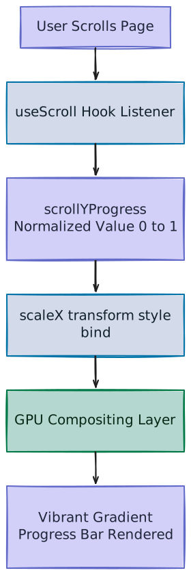
The flowchart below visualizes the initialization, calculation pipeline, and GPU layer compositing of the ScrollProgress component:
2. High-Level Overview
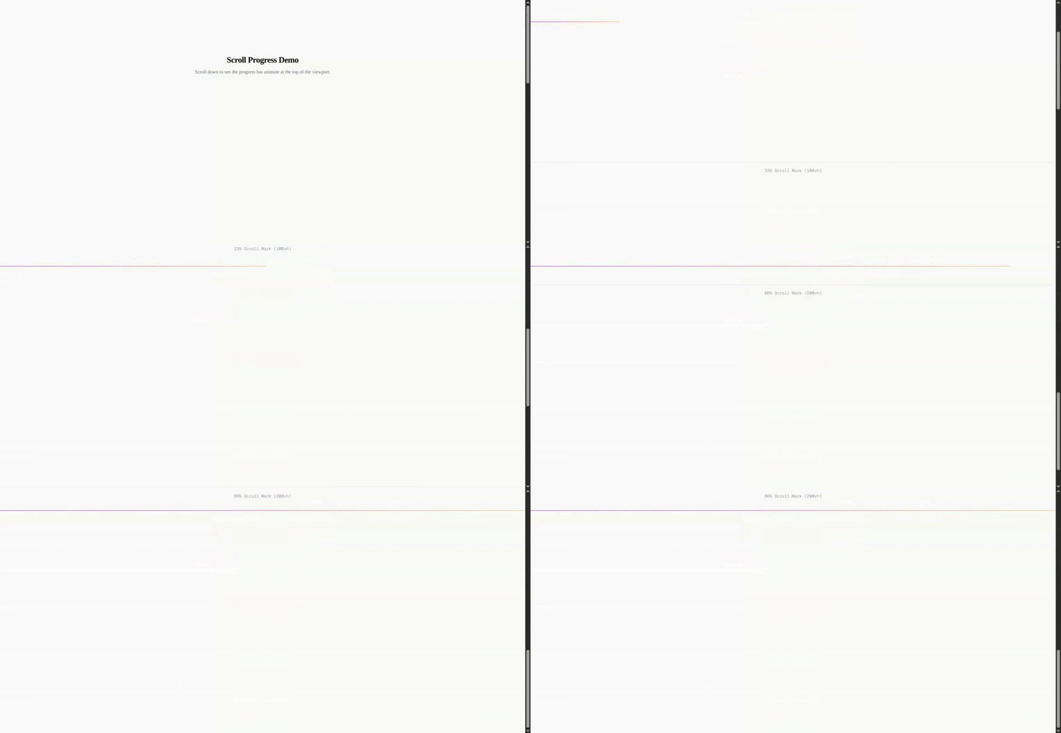
The ScrollProgress component tracks page scrolling positions in real-time and animates a minimal indicator bar along the edge of the viewport.
Common design considerations for scroll status visualizers:
- Real-time Synchronization: Directly linking scroll changes to visual updates without rendering latency or lag.
- Layout Isolation: Floating above standard document layouts so it does not shift surrounding elements during width transformations.
- Hardware Acceleration: Avoiding CPU recalculations on scroll loops to maintain high frames-per-second (FPS) rendering.
- Prop Merging: Accommodating client styling overrides (like shifting positioning or color themes) without breaking the core tracking layer.
3. Component Implementation (scroll-progress.tsx)
Below is the complete implementation of the ScrollProgress component:
"use client"

import { motion, useScroll, type MotionProps } from "motion/react"

import { cn } from "@/lib/utils"

interface ScrollProgressProps extends Omit<
  React.HTMLAttributes<HTMLElement>,
  keyof MotionProps
> {
  ref?: React.Ref<HTMLDivElement>
}

export function ScrollProgress({
  className,
  ref,
  ...props
}: ScrollProgressProps) {
  const { scrollYProgress } = useScroll()

  return (
    <motion.div
      ref={ref}
      className={cn(
        "fixed inset-x-0 top-0 z-50 h-px origin-left bg-linear-to-r from-[#A97CF8] via-[#F38CB8] to-[#FDCC92]",
        className
      )}
      style={{
        scaleX: scrollYProgress,
      }}
      {...props}
    />
  )
}
4. Scroll Tracking with useScroll
Framer Motion provides custom utility hooks to hook into scroll events without configuring manual event bindings.
const { scrollYProgress } = useScroll()- Dynamic Listener:
useScrollmonitors page viewport coordinates by registering optimized passive event listeners synced to the browser'srequestAnimationFramerender cycles. - Normalized Value Array:
scrollYProgressreturns a specializedMotionValuecontaining floats from0to1:0: The user is currently sitting at the very top of the page.1: The user has reached the bottom limits of the scrollable document body.
- Context Scope: By default, calling
useScroll()tracks the global page viewport. Developers can also pass element targets (targetandcontainerattributes) to track scrolling progress inside local scroll boxes.
5. Performance Optimization: scaleX vs. width (Compositing vs. Layout)
Linking scroll metrics to layout dimensions (like setting width: 0% to 100%) creates major rendering bottlenecks due to how browser engines draw webpages.
A. The Browser Paint Cycle
When styling attributes alter, browsers cycle through three distinct rendering phases:
┌──────────────┐     ┌──────────────┐     ┌──────────────┐
│  1. Layout   │ ──> │   2. Paint   │ ──> │3. Compositing│
└──────────────┘     └──────────────┘     └──────────────┘
  (Recalculates        (Rasterizes          (Combines layers
geometry) pixels) on GPU)- Layout (Reflow): Computes positions, heights, and widths. If an element's physical width changes, the browser must re-evaluate the geometry of that element and all adjacent siblings.
- Paint (Repaint): Paints pixels (background color, shadows, borders) on the calculated geometry boxes.
- Compositing: Groups the page into separate visual layers (like transparent sheets) and hands them to the GPU to stack, scale, or move them instantly.
B. The Bottleneck of Animating width
By animating width, scroll updates trigger a constant loop of Layout Reflows and Paints on the CPU. Under fast interactions, this layout thrashing drops frames, leading to stuttering animation flows.
C. Harnessing GPU scaleX Transforms
The ScrollProgress component avoids CPU-bound layout updates entirely by fixing the container width at a solid 100% and mapping the normalized scroll progress to a horizontal scale transform:
style={{
  scaleX: scrollYProgress,
}- GPU Offloading: Modifying CSS transform values (like
scaleXortranslate3d) skips Layout and Paint passes. The browser updates scaling directly during the Compositing pass on the GPU. - Reduced Overhead: This ensures the layout is resolved once at initial page load. Scrolling then shifts texture scales rather than recalculating layout dimensions, guaranteeing butter-smooth 60fps+ animations.
- Is scaleX: 0 identical to no width? Visually yes, the scale squashes the progress bar to 0 pixels horizontally, making it invisible. However, its layout width remains at 100%.
6. CSS Positions & Coordinate Anchors
The visual behavior of the scroll indicator depends on specific layout standard classes:
"fixed inset-x-0 top-0 z-50 h-px origin-left bg-linear-to-r from-[#A97CF8] via-[#F38CB8] to-[#FDCC92]"A. The Importance of origin-left
By default, the transform origin of standard elements is set at their physical center (50% 50%).
If origin-left was missing, scaling the element via scaleX would expand the bar outwards from the center to both left and right edges simultaneously:
Without origin-left (Scales from center):
        [========]
     [==============]
  [====================]

With origin-left (Scales from left):
  [===]
  [======]
  [=========[
Adding origin-left moves the anchor point to the coordinate left edge (0% on horizontal axis) so scaling extends the progress bar from left-to-right as coordinates progress.
7. Customizable Properties Reference
| Property | Default | Type | Description |
|---|---|---|---|
className | undefined | string | Optional Tailwind/CSS styles for customizing color gradients, heights, or positions (e.g., h-1 to thicken). |
ref | undefined | React.Ref<HTMLDivElement> | Forwarded React reference to access the underlying motion div. |
...props | — | ScrollProgressProps | Direct properties forwarded to the outer motion element. |