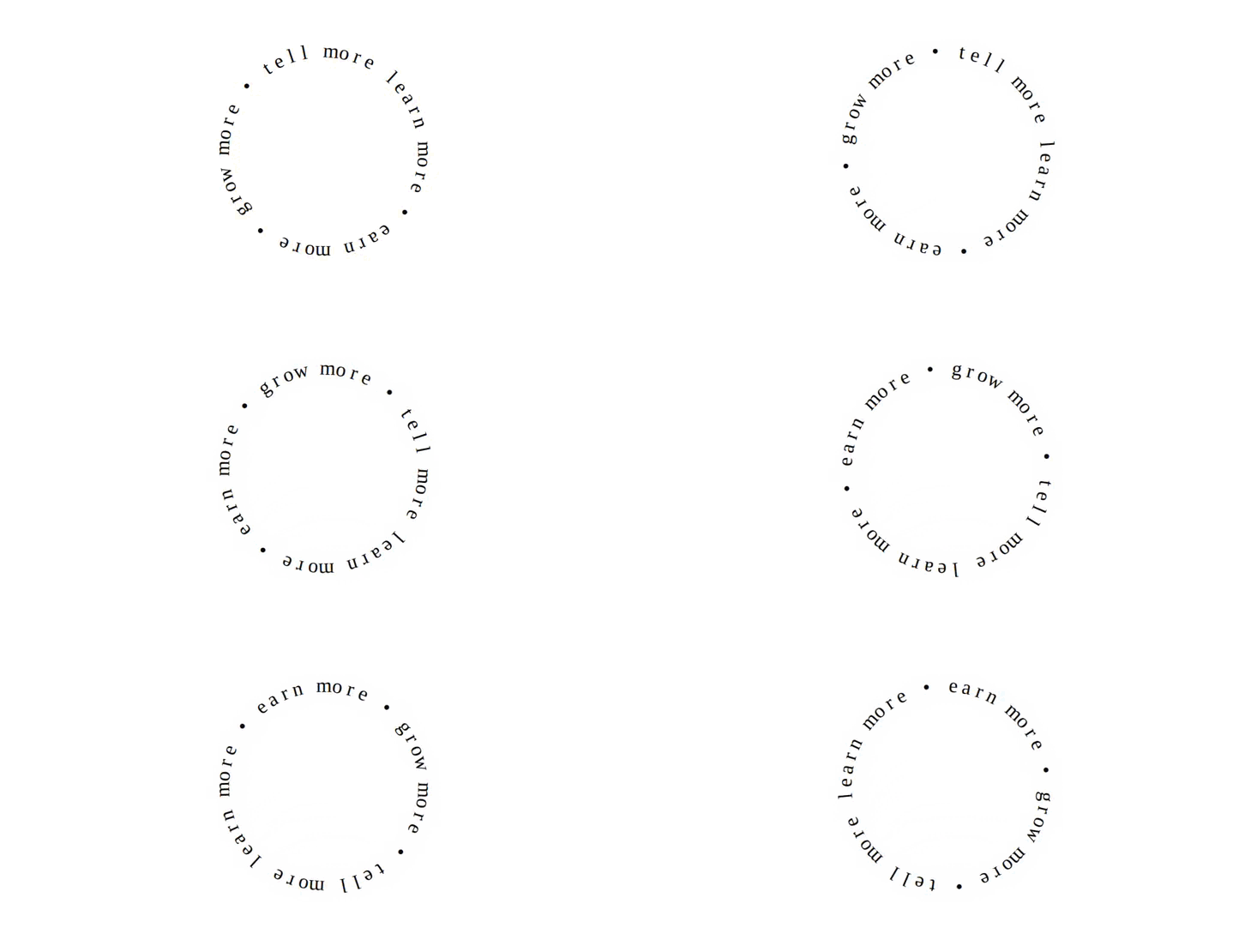
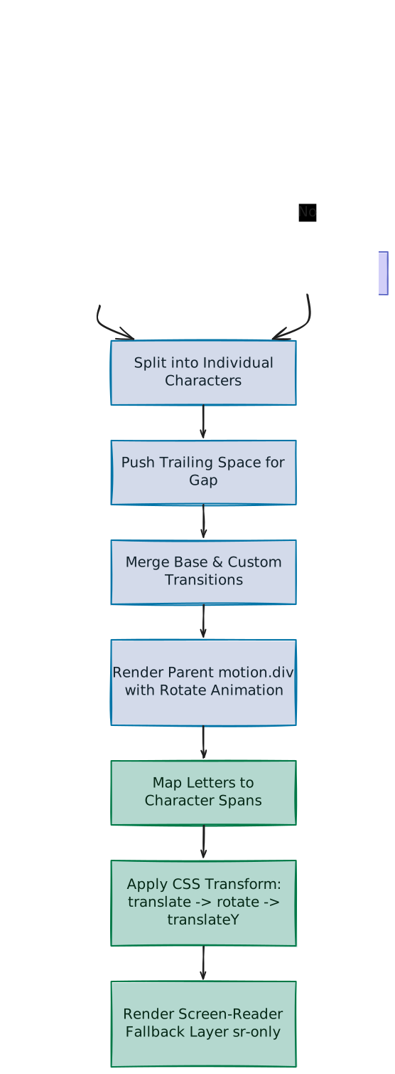
A breakdown of circular text layout geometry, dynamic CSS custom properties, responsive font scaling, and path rotations in React.
Implementation breakdown of the SpinningText component, covering its CSS vector translation-rotation mechanics, dynamic font scaling units, and accessibilty structure.
Browsers process transform properties from left to right, meaning the order of operations decides the final geometric layout:
translate(-50%, -50%): Centering absolute elements placing top: 50%; left: 50% coordinates the top-left corner of the letters at the center. This step offsets the span back by half its own height and width, positioning the visual center of each letter exactly at the parent's center point.
rotate(calc(360deg / var(--total) * var(--index))): Rotates the letter's local coordinate system around the center. For a text containing 12 characters, each character rotates by an increment of 30 degrees (e.g., character 0 remains at 0 degrees, character 1 turns 30 degrees, character 2 turns 60 degrees).
translateY(calc(var(--radius, 5) * -1ch)): Offsets the letter vertically. Since the previous step rotated the local coordinate grid, translating vertically pushes the character directly outwards along that rotated angle, placing it along the radius vector.
Imagine you stand in the exact center of a round table holding a stack of letter cards.
The Stack: You place all the cards in a single pile in the center of the table. At this stage, they are stacked directly on top of each other.
(This is standard CSS absolute centering).
The Coordinate Turn: You stand in the center, select each card one by one, and turn your body:
For the first card, you face straight forward (0 degrees).
For the second card, you rotate slightly to the right (e.g., 20 degrees).
For the third card, you rotate further right (e.g., 40 degrees).
The pile of cards is still at your feet in the center, but each card is now oriented outward in a different direction.
(This is the CSS rotation step).
The Step Forward: You instruct each card to walk straight forward. Because each card is oriented in a different direction, walking forward forces them to move away from the center along their respective axes.
(This is the CSS translation step).
As a result of these steps, the cards fan out to create a perfect circle.
It is worth noting that the individual glyphs (letters, numbers, etc.) themselves are never bent or deformed into curved shapes; they remain perfectly straight blocks. The layout forms a curved path purely through coordinate geometry:
The Turn Angle: Every letter has a slightly greater rotation than the one preceding it (e.g., 0deg, 30deg, 60deg...).
The Uniform Offset: Every letter is translated away from the center by the exact same radial distance (the radius value multiplied by 1ch).
Because each letter sits perpendicular to the radial line, their coordinate centers form a smooth circular ring:
        Vertical Axis
             |
             M  (0°)
       E           O (30°)
      ┌─────────────┐
    T │             │ N (60°)
      │    * Center │
    X │             │ T (90°)
      └─────────────┘
       E           E
             T
Instead of using JavaScript to interpolate unique, hardcoded values (like rotate(30deg)) for every character span, the component uses a single, uniform CSS transform template. Although JavaScript is still responsible for injecting the raw coordinates (--index and --total) during the loop, the mathematical translation-rotation math is written directly inside the CSS calc() formula, keeping the layout rules cleanly in the styling domain.
Because React typing rules validate inline style attributes against standard CSS properties, injecting custom variables like --index triggers compile-time type errors.
Casting the style object using:
{ ... } as React.CSSProperties
informs TypeScript that the object contains valid custom properties, bypassing compiler errors while letting the browser read variables like --index and --total.
To scale the circle's size dynamically when font sizes alter, the translation uses the relative CSS unit ch, which is directly tied to the component's radius prop:
1ch is equivalent to the width of the "0" (zero) character of the element's current font-weight and size.
Tied to Radius: The final offset is calculated as radius * -1ch (e.g., translateY(calc(var(--radius) * -1ch))). For example, with a default radius of 10, each character is translated outward by exactly 10 zero-character widths.
Responsive Scaling: If the font-size is changed (e.g., from 14px to 28px), 1ch doubles. This automatically doubles the radial offset and expands the circle proportionally.
Why ch over em? While 1em matches the font's height, 1ch represents the width of a single character glyph (the "0"). Because we are spacing letters sideways along a circular line, a width-based unit (ch) keeps spacing compact and proportional. If we used em (height), the circle would render twice as large, forcing unitless radius props to be tiny to compensate.
Why the negative coordinate (-1ch)? In CSS transforms, positive Y translations move elements downward. Using negative values (-1ch * radius) pushes the characters upward along their rotated local layout grids, translating them outwards away from the center to define the circle's edge.
For standard block HTML tags like <span>, the browser already defaults to using the physical center (50% 50%) as the anchor point for rotations. Removing this option does not disrupt visual output. However, specifying it serves multiple purposes:
Explicit Documentation: It clarifies that rotations are anchored around the center of the span elements.
Defensive Layout Standards: SVGs and legacy browsers can handle default transform origins differently. Specifying the target center prevents layout offset errors if HTML tags are updated during maintenance.
The JSX compiler splits this into an array of child fragments in JS:
children = ["Spinning ", "Motion", " text"]
Passing this array straight to .split("") causes runtime exceptions because .split is a string prototype method.
The component guards against this by checking:
if (Array.isArray(children)) { if (!children.every((child) => typeof child === "string")) { throw new Error("all elements in children array must be strings") } children = children.join("")}
This joins the split array elements back into a uniform string sequence ("Spinning Motion text") before initiating layouts.
When characters are arranged in a circular loop, the first character (index 0) and the final character (index letters.length - 1) are aligned right next to each other at the apex of the circle.
Without spacing, the text forms an unbroken loop (e.g., "TEXTTEXTTEXT..."), making it difficult to identify where the word starts and ends. Appending a space character (letters.push(" ")) injects a visual divider, ensuring a clear gap before the text repeats.
Instead of animating each character card separately, which would require multiple independent animation loops, the component rotates the parent motion.div wrapper.
To handle both styles without conflicts, the final configuration is merged:
const finalTransition: Transition = { ...BASE_TRANSITION, ...transition, duration: (transition as { duration?: number })?.duration ?? duration,}
This copies all user overrides (like ease or delay options) via the spread operator (...transition) and resolves the duration using the nullish coalescing operator (??). If a custom duration isn't present inside the transition object, it falls back to the duration prop.
Arranging text glyphs in separate spans (<span>S</span><span>p</span><span>i</span>...) causes screen readers to announce each letter individually, rendering the text incomprehensible for visually impaired users.
To prevent this:
Visual spans are hidden: We apply aria-hidden="true" to every mapped span so screen readers skip them completely.
Solid Text Fallback: We render an unfragmented copy of the source string inside a screen reader accessibility wrapper class:
<span className="sr-only">{children}</span>
This keeps the text readable by accessibility software and search-engine indexers without affecting the visual layout.