Morphing Text
A deep dive into SVG gooey threshold filters,requestAnimationFrame tickers, direct DOM manipulation, and dynamic opacity-blur synchronizations.
Implementation breakdown of the MorphingText component, covering its SVG gooey filter mechanics and high-performance ref-based DOM updates.
[!NOTE] This component is inspired by the Magic UI Morphing Text
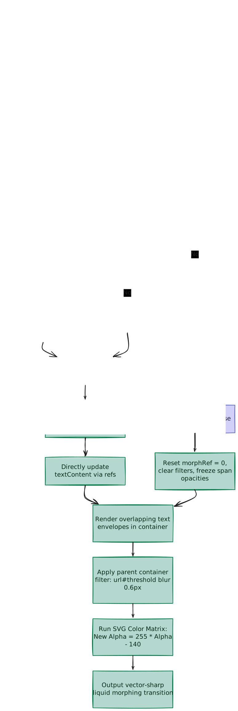
1. High-Level Flow Chart
The flowchart below visualizes the execution pipeline of the morphing text sequence. It illustrates how the custom animation frame loop alternates between active morphing and cooldown periods, dynamically computing blur and opacity before the SVG color matrix snaps the overlapping elements into a unified fluid contour:
2. High-Level Overview
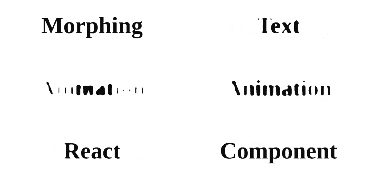
The MorphingText component create a "liquid metal" or "gooey" morphing effect where characters appear to slide, melt, combine, and snap apart like droplets of mercury.
This behavior is achieved using three core principles:
- Overlapping Spans: Two text containers are positioned directly on top of each other using relative/absolute layouts.
- Coordinated Blur & Opacity Easing: While one word fades out (blurring up and fading to transparent), the other fades in (blurring down and fading to opaque) simultaneously.
- SVG Thresholding: An invisible SVG color matrix filter acts on the parent container. It strips away faint outer blur coordinates while solidifying intersecting, dense overlap regions into clean, continuous shapes.
3. Component Implementation (morphing-text.tsx)
Below is the complete implementation of the MorphingText component:
"use client"

import { useCallback, useEffect, useRef } from "react"
import { cn } from "@/lib/utils"

const morphTime = 1.5
const cooldownTime = 0.5

const useMorphingText = (texts: string[]) => {
  const textIndexRef = useRef(0)
  const morphRef = useRef(0)
  const cooldownRef = useRef(0)
  const timeRef = useRef(new Date())

  const text1Ref = useRef<HTMLSpanElement>(null)
  const text2Ref = useRef<HTMLSpanElement>(null)

  const setStyles = useCallback(
    (fraction: number) => {
      const [current1, current2] = [text1Ref.current, text2Ref.current]
      if (!current1 || !current2) return

      // Incoming text styles (blurs down from 100px to 0px, opacity fades up)
      current2.style.filter = `blur(${Math.min(8 / fraction - 8, 100)}px)`
      current2.style.opacity = `${Math.pow(fraction, 0.4) * 100}%`

      // Outgoing text styles (blurs up from 0px to 100px, opacity fades down)
      const invertedFraction = 1 - fraction
      current1.style.filter = `blur(${Math.min(
        8 / invertedFraction - 8,
        100
      )}px)`
      current1.style.opacity = `${Math.pow(invertedFraction, 0.4) * 100}%`

      current1.textContent = texts[textIndexRef.current % texts.length]
      current2.textContent = texts[(textIndexRef.current + 1) % texts.length]
    },
    [texts]
  )

  const doMorph = useCallback(() => {
    morphRef.current -= cooldownRef.current
    cooldownRef.current = 0

    let fraction = morphRef.current / morphTime

    if (fraction > 1) {
      cooldownRef.current = cooldownTime
      fraction = 1
    }

    setStyles(fraction)

    if (fraction === 1) {
      textIndexRef.current++
    }
  }, [setStyles])

  const doCooldown = useCallback(() => {
    morphRef.current = 0
    const [current1, current2] = [text1Ref.current, text2Ref.current]
    if (current1 && current2) {
      current2.style.filter = "none"
      current2.style.opacity = "100%"
      current1.style.filter = "none"
      current1.style.opacity = "0%"
    }
  }, [])

  useEffect(() => {
    let animationFrameId: number

    const animate = () => {
      animationFrameId = requestAnimationFrame(animate)

      const newTime = new Date()
      const dt = (newTime.getTime() - timeRef.current.getTime()) / 1000
      timeRef.current = newTime

      cooldownRef.current -= dt

      if (cooldownRef.current <= 0) doMorph()
      else doCooldown()
    }

    animate()
    return () => {
      cancelAnimationFrame(animationFrameId)
    }
  }, [doMorph, doCooldown])

  return { text1Ref, text2Ref }
}

interface MorphingTextProps {
  className?: string
  texts: string[]
}

const Texts: React.FC<Pick<MorphingTextProps, "texts">> = ({ texts }) => {
  const { text1Ref, text2Ref } = useMorphingText(texts)
  return (
    <>
      <span
        className="absolute inset-x-0 top-0 m-auto inline-block w-full"
        ref={text1Ref}
      />
      <span
        className="absolute inset-x-0 top-0 m-auto inline-block w-full"
        ref={text2Ref}
      />
    </>
  )
}

const SvgFilters: React.FC = () => (
  <svg
    id="filters"
    className="fixed h-0 w-0"
    preserveAspectRatio="xMidYMid slice"
  >
    <defs>
      <filter id="threshold">
        <feColorMatrix
          in="SourceGraphic"
          type="matrix"
          values="1 0 0 0 0
                  0 1 0 0 0
                  0 0 1 0 0
                  0 0 0 255 -140"
        />
      </filter>
    </defs>
  </svg>
)

export const MorphingText: React.FC<MorphingTextProps> = ({
  texts,
  className,
}) => (
  <div
    className={cn(
      "relative mx-auto h-16 w-full max-w-3xl text-center font-sans text-[40pt] leading-none font-bold filter-[url(#threshold)_blur(0.6px)] md:h-24 lg:text-[6rem]",
      className
    )}
  >
    <Texts texts={texts} />
    <SvgFilters />
  </div>
)
4. Coordinated Blur & Opacity Curves
To ensure the text remains legible and never completely disappears during transitions, the component coordinates changes to both blur and opacity.
A. The Scaling Easing curves
The morphing progress is represented by a value called fraction which increases from 0 to 1 over the 1.5 second duration.
Instead of moving linearly, the properties use custom math models:
- The Decelerating Blur Curve (
8 / fraction - 8): Drops the blur rapidly in the first half but decelerates once it enters the active "gooey" range (0px to 10px). This keeps character outlines fuzzy longer, providing the SVG filter more time to merge them. - The Accelerating Opacity Curve (
fraction^0.4): Ramps up opacity rapidly early on (e.g., reaching 75% opacity at just 50% progress). This guarantees the incoming word has enough pixel density to form a visible gooey overlap immediately.
B. Progression value Trace Table
The table below traces the exact styling values calculated at key points during the transition cycle of the incoming word:
Progress (fraction) | Operations (Blur Math) | Final CSS Blur | Operations (Opacity Math) | Final CSS Opacity | Visual Representation |
|---|---|---|---|---|---|
0.01 (Start) | 8 / 0.01 - 8 = 792 | blur(100px) | 0.01^0.4 = 0.158 | 15.8% | Faint, heavily blurred cloud |
0.08 | 8 / 0.08 - 8 = 92 | blur(92px) | 0.08^0.4 = 0.364 | 36.4% | Blur begins contracting |
0.20 | 8 / 0.20 - 8 = 32 | blur(32px) | 0.20^0.4 = 0.525 | 52.5% | Outline details start shaping |
0.50 (Midpoint) | 8 / 0.50 - 8 = 8 | blur(8px) | 0.50^0.4 = 0.757 | 75.7% | Liquid merging (maximum gooey flow) |
0.80 | 8 / 0.80 - 8 = 2 | blur(2px) | 0.80^0.4 = 0.914 | 91.4% | Almost sharp text |
1.00 (End) | 8 / 1.00 - 8 = 0 | blur(0px) | 1.00^0.4 = 1.000 | 100.0% | Razor-sharp focused lettering |
5. The SVG Gooey Threshold Filter
To convert two overlapping blurry cards into one sharp liquid shape, the browser runs a custom pixel matrix calculation.
A. Color Matrix Layout
The SVG filter primitive <feColorMatrix> multiplies the color channels (Red, Green, Blue, Alpha) of every pixel by a grid of values:
                  Input Channels
              [ R_in  G_in  B_in  A_in  Multiplier ]
Row 1 (Red):   [  1,    0,    0,    0,        0     ]  => R_out = R_in
Row 2 (Green): [  0,    1,    0,    0,        0     ]  => G_out = G_in
Row 3 (Blue):  [  0,    0,    1,    0,        0     ]  => B_out = B_in
Row 4 (Alpha): [  0,    0,    0,  255,     -140     ]  => A_out = (255 * A_in) - 140
Because the red, green, and blue coordinates match the diagonal identity matrix, they are unmodified. The text retains its original color.
B. Alpha Channel Mathematical Transformation
The final row implements a high-contrast switch acting on the Alpha channel:
New Alpha = (255 * Alpha) - 140
Depending on the input opacity, the calculation behaves like a binary switch:
- Faint Outer Blur (Alpha =
0.3):New Alpha = (255 * 0.3) - 140 = -65The graphics engine clamps values below zero to0.0(fully transparent), erasing the fuzzy outer borders. - Core Text & Intersecting Overlaps (Alpha =
0.6):New Alpha = (255 * 0.6) - 140 = 13The graphics engine clamps values above one to1.0(fully solid), turning the transparent bridge into a solid color.
C. Blur Density & Overlap Fusion
- Core Stokes Stay Solid: A CSS blur spreads pixels outward. The center of a character's stroke retains the highest concentration of outline pixels (high Alpha), while the outer edges fade toward
0.0. - Overlapping Edges Merge: When the blurred shapes of two words overlap, they bleed together, causing their opacities to add up (simplification). This combined density is highest in the space between the letters, prompting the SVG filter to draw a solid liquid bridge there.
D. Deriving the Magic Numbers
- Why 255?
To snap pixels to solid across a single pixel boundary (the sharpest edge possible), we must scale the smallest 8-bit increment (
1/255opacity) to1.0. A multiplier of255achieves this. Higher values yield identical sharpness, while lower values leave fuzzy edges. - Why -140?
This offset sets the opacity cutoff point (
140 / 255 ≈ 55%opacity):- Too low (e.g., -100 / 39%): Keeps too much blur, making characters look bloated and bleed together.
- Too high (e.g., -200 / 78%): Loses too much blur, making characters look thin or fractured (broken gaps).
- -140 (55%): The design sweet spot that preserves the font's natural weight.
6. requestAnimationFrame Timeline Mechanics
To run fluid animations, timing loops must act independently of a device's refresh rate.
const animate = () => {
  animationFrameId = requestAnimationFrame(animate)

  const newTime = new Date()
  const dt = (newTime.getTime() - timeRef.current.getTime()) / 1000
  timeRef.current = newTime

  cooldownRef.current -= dt

  if (cooldownRef.current <= 0) doMorph()
  else doCooldown()
}
A. Frame Rate Independence
Browsers fire requestAnimationFrame at matching refresh rates (e.g., 60Hz vs. 120Hz). If we updated timers in flat steps per block execution, the animation would run twice as fast on high-performance gaming monitors.
Implementing delta-time:
dt = (newTime.getTime() - timeRef.current.getTime()) / 1000
measures the actual seconds elapsed since the last rendering step (roughly 0.016s at 60fps). This locks speed across all screens.
B. Morph Progress Accumulation
On each frame, morphRef.current accumulates the elapsed time (dt) via the temporary cooldownRef bucket:
morphRef.current -= cooldownRef.current // Adds dt to morphRef each frame
cooldownRef.current = 0
This continues every frame until morphRef.current reaches morphTime (1.5 seconds). At that point, fraction exceeds 1, and the cooldown is scheduled by setting:
cooldownRef.current = cooldownTime // = 0.5 secondsOn the next frame, the loop sees cooldownRef > 0 and switches to doCooldown() for the 0.5 second rest period.
7. Performance & CSS Optimizations
Updating UI properties continuously requires efficient layout patterns.
- Ref-Based DOM Writes:
Instead of mutating React state variables (
useState) which would force parent component reconciliation 60 times a second, this component links straight to the nodes using refs (text1Refandtext2Ref). Mutating.styleand.textContentdirectly keeps calculations fast and lightweight. - Container-Level Filters:
The styling is declared on the parent container wrapper:
filter-[url(#threshold)_blur(0.6px)]. If we applied the filters to the individual children separately, they would render in isolated contexts. Because they wouldn't share layout data, their blurs could not add together, and the gooey merging bridge would never form. - Jagged Border Anti-Aliasing (
blur(0.6px)): The high contrast matrix creates sharp boundaries. On rounded character arcs (likeOore), this can sometimes show jagged, pixelated "staircases". Inserting a sub-pixel blur of0.6px(less than half of one device pixel) acts as anti-aliasing. It softens curves into smooth vector outlines without losing readability. - Modulo Index Looping (
%): To preload and morph text, both elements hold active texts at the same time:current1displays the current word index (index % length).current2preloads the next index ((index + 1) % length). The modulo operator wraps the pointer safely, preventing out-of-bound errors.
8. Customizable Properties Reference
| Property | Default | Type | Description |
|---|---|---|---|
texts | — | string[] | Ordered list of text strings cycled through the morphing pipeline. |
className | undefined | string | Optional container style overrides. |
Scroll Based Velocity
An explanation of the ScrollVelocity component: creating a high-performance scroll-driven marquee using Framer Motion and GPU-accelerated canvas translations.
Spinning Text
A breakdown of circular text layout geometry, dynamic CSS custom properties, responsive font scaling, and path rotations in React.