Images Badge
A breakdown of DOM layering, card-spread mathematical calculations, and Framer Motion spring physics in interactive folder badges.
Implementation breakdown of the ImagesBadge component, covering its layer stacking, symmetric card-spread formulas, and spring physics.
[!NOTE] This component is referenced from the Aceternity UI Images Badge.
1. High-Level Overview
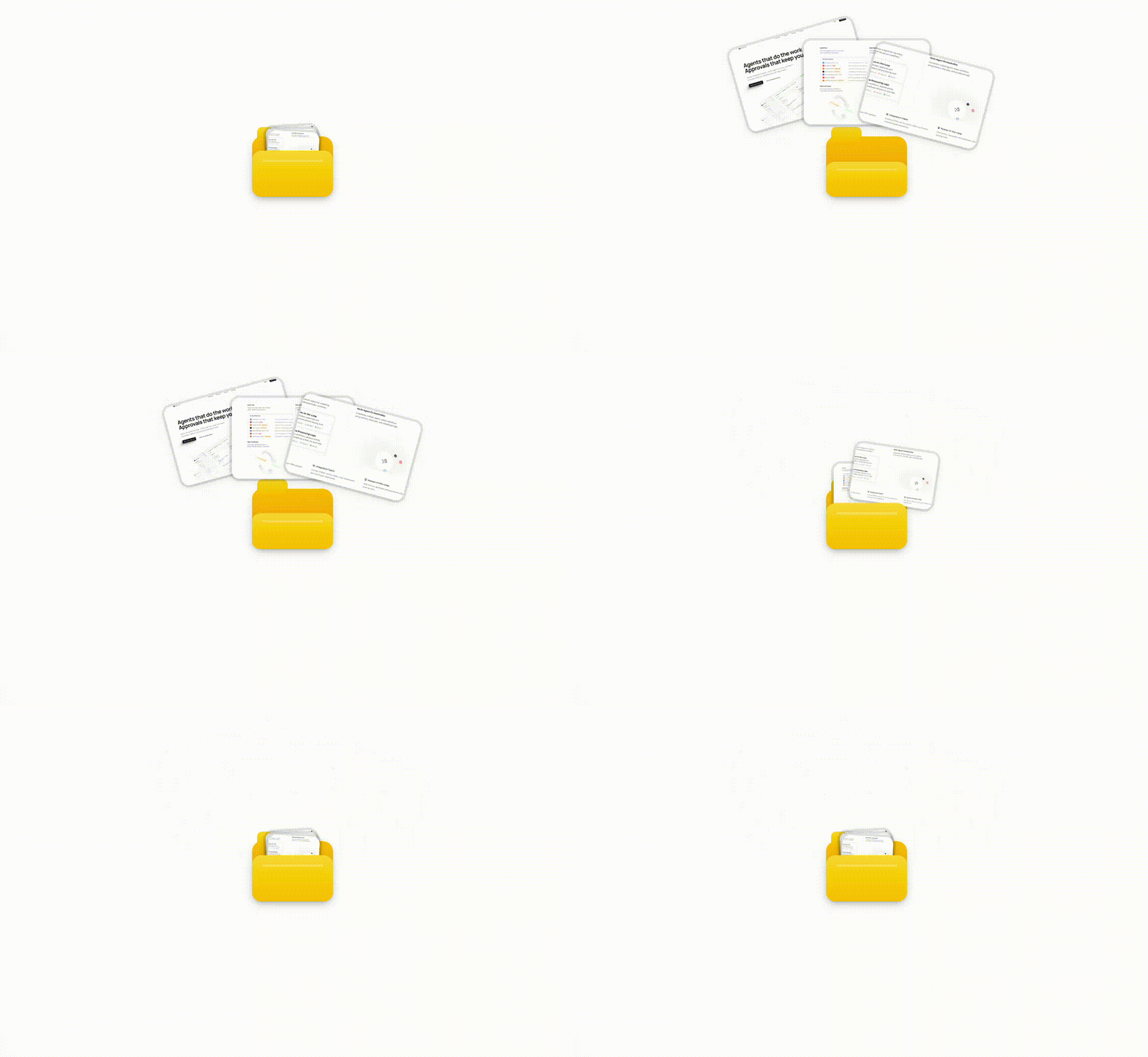
The ImagesBadge component displays a small folder-style badge containing up to 3 image cards tucked inside.
- Default State (Tease): The image cards peek slightly out of the top pocket of the folder with a subtle tilt, inviting interaction.
- Hover State: The front flap tilts open wider, and the image cards smoothly scale up, fan out in a symmetrical card-spread pattern, and pop upward.
2. Component Implementation (images-badge.tsx)
Below is the complete implementation of the ImagesBadge component using motion for spring-loaded physical interactions:
"use client";

import React, { useState } from "react";
import { motion } from "motion/react";
import { cn } from "@/lib/utils";

interface ImagesBadgeProps {
  text: string;
  images: string[];
  className?: string;
  /** Optional link URL */
  href?: string;
  /** Link target attribute (e.g., "_blank" for new tab) */
  target?: string;
  /** Folder dimensions { width, height } in pixels */
  folderSize?: { width: number; height: number };
  /** Image dimensions when teased (peeking) { width, height } in pixels */
  teaserImageSize?: { width: number; height: number };
  /** Image dimensions when hovered { width, height } in pixels */
  hoverImageSize?: { width: number; height: number };
  /** How far images translate up on hover in pixels */
  hoverTranslateY?: number;
  /** How far images spread horizontally on hover in pixels */
  hoverSpread?: number;
  /** Rotation angle for fanned images on hover in degrees */
  hoverRotation?: number;
}

export function ImagesBadge({
  text,
  images,
  className,
  href,
  target,
  folderSize = { width: 32, height: 24 },
  teaserImageSize = { width: 20, height: 14 },
  hoverImageSize = { width: 48, height: 32 },
  hoverTranslateY = -35,
  hoverSpread = 20,
  hoverRotation = 15,
}: ImagesBadgeProps) {
  const [isHovered, setIsHovered] = useState(false);

  // Limit to max 3 images
  const displayImages = images.slice(0, 3);

  // Calculate folder tab dimensions proportionally
  const tabWidth = folderSize.width * 0.375;
  const tabHeight = folderSize.height * 0.25;

  const Component = href ? "a" : "div";

  return (
    <Component
      href={href}
      target={target}
      rel={target === "_blank" ? "noopener noreferrer" : undefined}
      className={cn(
        "inline-flex cursor-pointer items-center gap-2 perspective-[1000px] transform-3d",
        className,
      )}
      onMouseEnter={() => setIsHovered(true)}
      onMouseLeave={() => setIsHovered(false)}
    >
      {/* Folder Container */}
      <motion.div
        className="relative"
        style={{
          width: folderSize.width,
          height: folderSize.height,
          transformStyle: "preserve-3d",
        }}
      >
        {/* Folder Back */}
        <div className="absolute inset-0 rounded-[4px] bg-gradient-to-b from-amber-400 to-amber-500 shadow-sm dark:from-amber-500 dark:to-amber-600">
          {/* Folder Tab */}
          <div
            className="absolute left-0.5 rounded-t-[2px] bg-gradient-to-b from-amber-300 to-amber-400 dark:from-amber-400 dark:to-amber-500"
            style={{
              top: -tabHeight * 0.65,
              width: tabWidth,
              height: tabHeight,
            }}
          />
        </div>

        {/* Images that pop out */}
        {displayImages.map((image, index) => {
          const totalImages = displayImages.length;

          // Calculate rotation based on index
          const baseRotation =
            totalImages === 1
              ? 0
              : totalImages === 2
                ? (index - 0.5) * hoverRotation
                : (index - 1) * hoverRotation;

          // Hover positions - fan out
          const hoverY = hoverTranslateY - (totalImages - 1 - index) * 3;
          const hoverX =
            totalImages === 1
              ? 0
              : totalImages === 2
                ? (index - 0.5) * hoverSpread
                : (index - 1) * hoverSpread;

          // Teaser positions - slight peek from folder
          const teaseY = -4 - (totalImages - 1 - index) * 1;
          const teaseRotation =
            totalImages === 1
              ? 0
              : totalImages === 2
                ? (index - 0.5) * 3
                : (index - 1) * 3;

          return (
            <motion.div
              key={index}
              className="absolute top-0.5 left-1/2 origin-bottom overflow-hidden rounded-[3px] bg-white shadow-sm ring-1 shadow-black/10 ring-black/10 dark:bg-neutral-800 dark:shadow-white/10 dark:ring-white/10"
              animate={{
                x: `calc(-50% + ${isHovered ? hoverX : 0}px)`,
                y: isHovered ? hoverY : teaseY,
                rotate: isHovered ? baseRotation : teaseRotation,
                width: isHovered ? hoverImageSize.width : teaserImageSize.width,
                height: isHovered
                  ? hoverImageSize.height
                  : teaserImageSize.height,
              }}
              transition={{
                type: "spring",
                stiffness: 400,
                damping: 25,
                delay: index * 0.03,
              }}
              style={{
                zIndex: 10 + index,
              }}
            >
              <img
                src={image}
                alt={`Preview ${index + 1}`}
                className="h-full w-full object-cover"
              />
            </motion.div>
          );
        })}

        {/* Folder Front (flattens on hover) */}
        <motion.div
          className="absolute inset-x-0 bottom-0 h-[85%] origin-bottom rounded-[4px] bg-gradient-to-b from-amber-300 to-amber-400 shadow-sm dark:from-amber-400 dark:to-amber-500"
          animate={{
            rotateX: isHovered ? -45 : -25,
            scaleY: isHovered ? 0.8 : 1,
          }}
          transition={{
            type: "spring",
            stiffness: 400,
            damping: 25,
          }}
          style={{
            transformStyle: "preserve-3d",
            zIndex: 20,
          }}
        >
          {/* Folder line detail */}
          <div className="absolute top-1 right-1 left-1 h-px bg-amber-200/50 dark:bg-amber-300/50" />
        </motion.div>
      </motion.div>

      {/* Text */}
      <span className="text-sm font-medium text-neutral-700 dark:text-neutral-200">
        {text}
      </span>
    </Component>
  );
}
3. Folder Back Plate: Flat Positioning & Tab Geometry
The backing of the folder represents the static physical layer behind which the popped-out images are layered.
A. Flat 2D Layout Box
Instead of relying on a 3D perspective context (perspective and preserve-3d), the component achieves depth through absolute nesting and standard z-index stacking. The wrapper box establishes the layout frame:

- Container Class:
inline-flex cursor-pointer items-center gap-2 - Folder Backing Panel: Positioned using
absolute inset-0. It occupies the bottom-most layer. By sitting beneath the cards (z-index: 10 + index) and the front cover (z-index: 20), it acts as the reference origin for all child positioning.
B. Proportional Tab Geometry
To maintain visual proportions when developers modify the folder size props, the tab dimensions scale dynamically from the parent folderSize:

tabWidth = folderSize.width * 0.375(Fixed at 37.5% of folder width, defaulting to 12px)tabHeight = folderSize.height * 0.25(Fixed at 25% of folder height, defaulting to 6px)
The tab's vertical placement relative to the folder's top edge uses a negative offset:
top: -tabHeight * 0.65
By pulling the tab upward by 65% of its calculated height, it sits cleanly above the top folder margin, rendering a Manila tab look that remains responsive to custom sizes.
4. Moving Parts of the Animation
The hover micro-interaction comprises two primary moving parts, both animated using Framer Motion springs.
1. Folder Front Cover flap (motion.div at bottom)

- Trigger: Hover state change (
isHovered). - Moving Property:
rotateX(X-axis rotation to represent flap opening).- Default/Unhovered State:
rotateX: -25deg(slightly open/slanted forward). - Hovered State:
rotateX: -45deg(tilts fully open/forward).
- Default/Unhovered State:
- Physics/Transition:
- Standard spring:
stiffness: 400,damping: 25, no delay.
- Standard spring:
2. Image Cards Array (displayImages.map(...))
- Card Elements Box: Positioned at
absolute top-0.5 left-1/2withorigin-bottomso fanning tilts rotate symmetrically around the card's bottom edge.
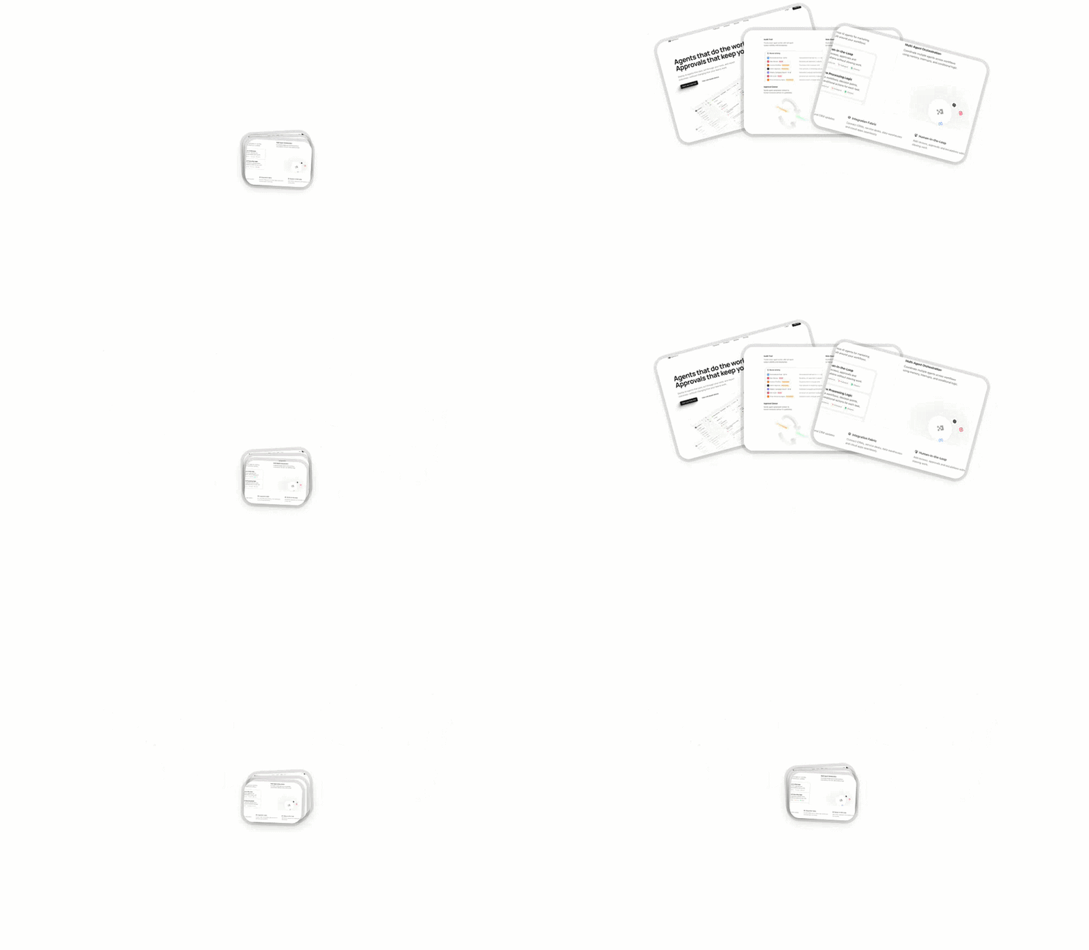
Each card is individually animated with an index-specific delay, creating a cascading fan effect. The moving properties are:
A. Horizontal Displacement (x-axis)
- Property:
xcoord offset. - Calculation:
x: calc(-50% + ${isHovered ? hoverX : 0}px) - Centering Translation Combo: Because each card is absolute at
left-1/2(50% parent width), it needs a base-50%horizontal offset to remain centered. Thecalc(-50% + ...)expression lets Framer Motion preserve this layout center point while applying the dynamic fanning offsethoverXon hover. - Resulting fan spread:
- Default State:
0px(cards stay stacked horizontally in the center frame). - Hovered State: Symmetrical fan-out offset using the index and
hoverSpreadsettings:- 1 Card:
0px(remains central). - 2 Cards:
-10pxand+10px(splits left/right of center). - 3 Cards:
-20px,0px, and+20px(fans evenly around the middle).
- 1 Card:
- Default State:
B. Vertical Upward Pop (y-axis)
- Property:
ycoord offset. - Calculation:
isHovered ? hoverY : teaseY - Resulting pop vertical motion:
- Default State:
teaseY(subtle vertical cascade offset from-4pxto-6pxat the pocket opening). - Hovered State:
hoverY(pops upwards out of the pocket by thehoverTranslateYparameter, e.g.,-35px).
- Default State:
C. Card Fan Angle Rotation (rotate)
- Property:
rotatevalue (in degrees). - Calculation:
isHovered ? baseRotation : teaseRotation - Transform Hinge Choice (
origin-bottom): Standard rotations swing elements around their geometric center (origin-center). Setting the transform origin to the bottom center edge acts as a physical hinge; rotation coordinates swing the top parts of the cards outward, mimicking playing cards fanning out of a single central grip point. - Resulting tilt values:
- Default State:
teaseRotation(subtle fan-out, e.g.,-3°,0°,+3°for 3 images). - Hovered State:
baseRotation(maximum fan-out, e.g.,-15°,0°,+15°for 3 images).
- Default State:
D. Scaling Dimensions (width & height)
- Properties:
width,height. - State Values:
- Default State: Small teaser dimensions (e.g.,
20pxwidth by14pxheight). - Hovered State: Expands/magnifies on hover to full size (e.g.,
48pxwidth by32pxheight).
- Default State: Small teaser dimensions (e.g.,
E. Staggered Delay timing
- Property:
delayon spring. - Calculation:
index * 0.03 - Effect: Staggers card movement starts by
30msper card (Card 0 starts instantly, Card 1 after 30ms, Card 2 after 60ms).