Shine Border
A deep dive into CSS mask composites, padding-based boundary offsets, and giant radial gradients generating glowing shine animations.
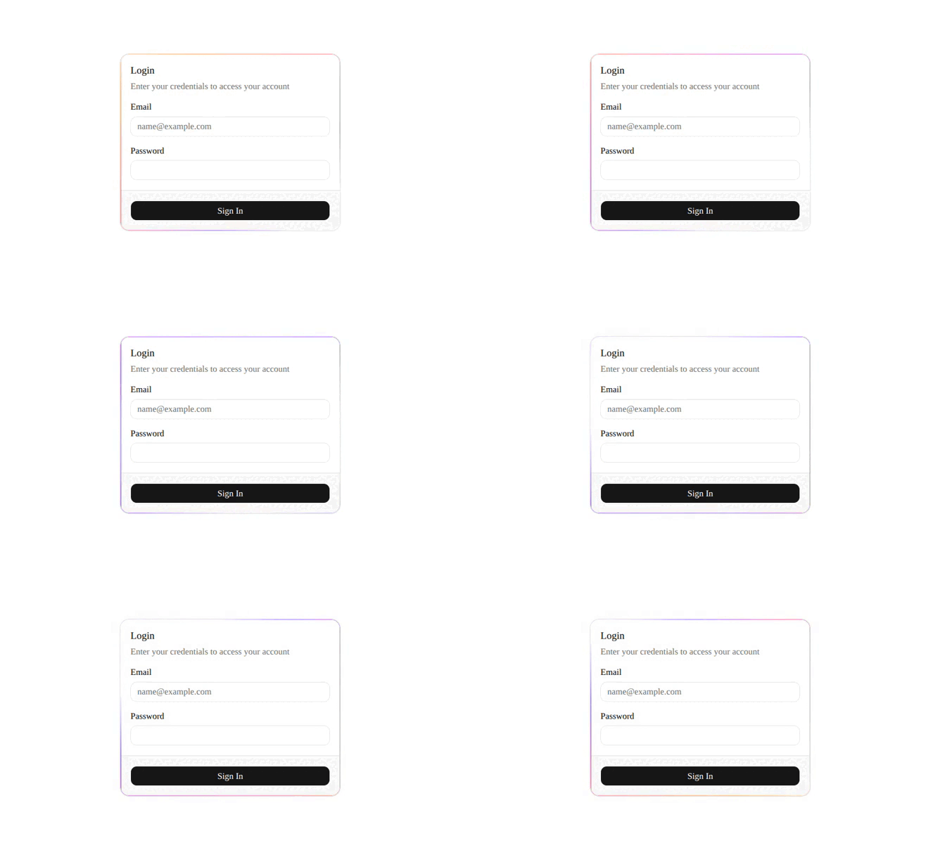
Implementation breakdown of the ShineBorder component, covering its padding-defined boundary geometry, dual-layered mask compositing, and hardware-accelerated diagonal gradient animation.
[!NOTE] This component is referenced from the Magic UI Shine Border.
1. High-Level Flow Chart
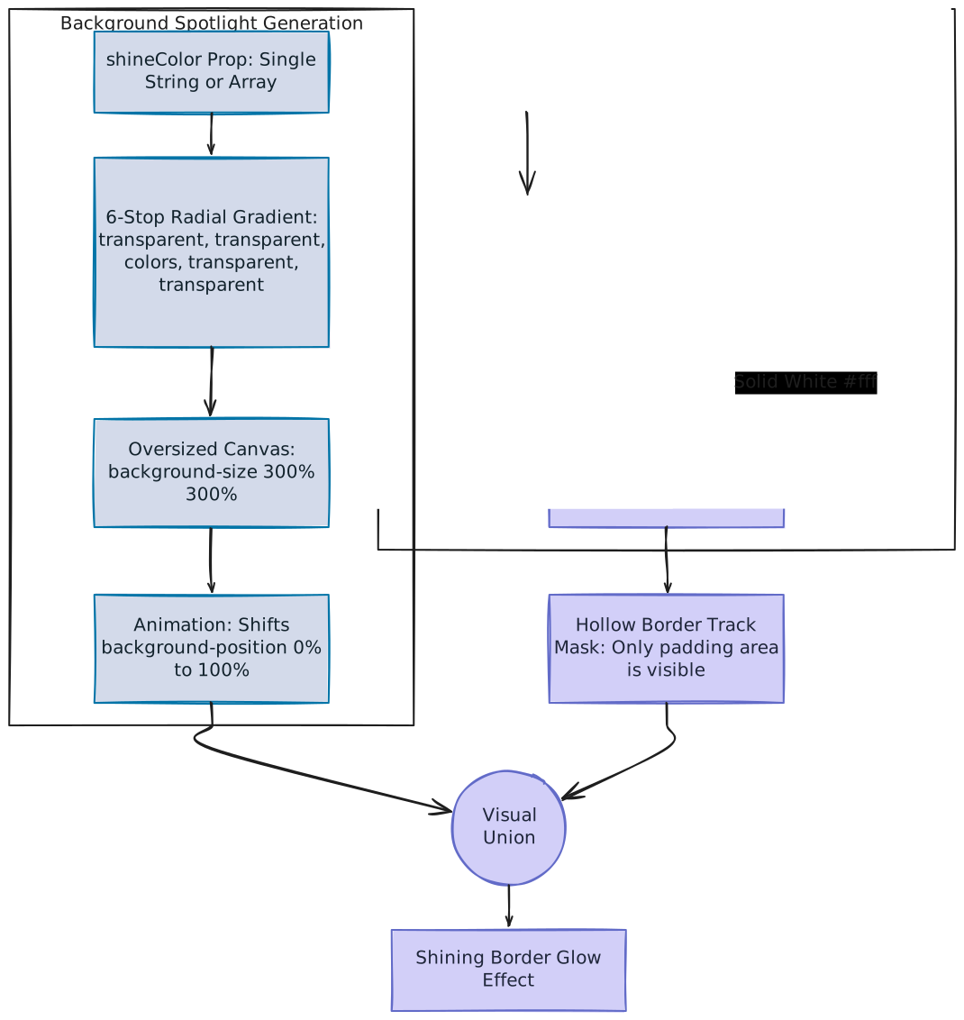
The diagram below details how the oversized background gradient and the subtractive masks combine using CSS mask compositing to construct a sharp, animated glowing border offset:
2. High-Level Overview
The ShineBorder component renders an animated border overlay effect around a container. Rather than drawing intricate SVG nodes or overlaying multiple HTML elements that might block pointer interactions, it executes this using native browser paint boundaries:
- Dual Mask Exclude: Subtracts an inner content-box mask from a full border-box mask, generating a hollow border window.
- Oversized Radial Gradient: Places the glow colors inside a huge radial gradient.
- Background Position Shifting: Animates background alignment diagonally on the GPU, creating a clean spotlight movement.
- Touch-Safe Overlay: Leverages absolute positioning and
pointer-events-noneso underlying content stays completely interactive.
3. Component Implementation (shine-border.tsx)
Below is the complete implementation of the ShineBorder component using React and Tailwind CSS:
"use client"

import * as React from "react"

import { cn } from "@/lib/utils"

interface ShineBorderProps extends React.HTMLAttributes<HTMLDivElement> {
  /**
   * Width of the border in pixels
   * @default 1
   */
  borderWidth?: number
  /**
   * Duration of the animation in seconds
   * @default 14
   */
  duration?: number
  /**
   * Color of the border, can be a single color or an array of colors
   * @default "#000000"
   */
  shineColor?: string | string[]
}

/**
 * Shine Border
 *
 * An animated background border effect component with configurable properties.
 */
export function ShineBorder({
  borderWidth = 1,
  duration = 14,
  shineColor = "#000000",
  className,
  style,
  ...props
}: ShineBorderProps) {
  return (
    <div
      style={
        {
          "--border-width": `${borderWidth}px`,
          "--duration": `${duration}s`,
          backgroundImage: `radial-gradient(transparent,transparent, ${
            Array.isArray(shineColor) ? shineColor.join(",") : shineColor
          },transparent,transparent)`,
          backgroundSize: "300% 300%",
          mask: `linear-gradient(#fff, #fff) content-box, linear-gradient(#fff, #fff)`,
          WebkitMask: `linear-gradient(#fff, #fff) content-box, linear-gradient(#fff, #fff)`,
          WebkitMaskComposite: "xor",
          maskComposite: "exclude",
          padding: "var(--border-width)",
          ...style,
        } as React.CSSProperties
      }
      className={cn(
        "motion-safe:animate-shine pointer-events-none absolute inset-0 size-full rounded-[inherit] will-change-[background-position]",
        className
      )}
      {...props}
    />
  )
}
4. The Core Architecture & CSS Masking
CSS masking acts as a transparency map for layout rendering:
- Opaque pixels (Solid White =
#fff): Show the background card/gradient beneath them. - Transparent pixels: Hide the background card/gradient entirely.
A. Exclude Composite Logic
The mask configuration sets up two solid white layers and subtracts one from the other:
mask: `linear-gradient(#fff, #fff) content-box, linear-gradient(#fff, #fff)`,
WebkitMaskComposite: "xor",
maskComposite: "exclude",-
linear-gradient(#fff, #fff): The browser'smaskproperty requires an image source. A raw CSS color code like#fffis not allowed here and will throw an error. We use a linear gradient to generate a solid white image dynamically inline, which the browser then uses as a solid mask layer. -
content-box(Layer 1): Limits the first mask layer to the inner content area (excluding the padding). -
Default
border-box(Layer 2): Extends the second mask layer to cover the entire container (including the padding). -
exclude/xorCompositing: Directs the browser to subtract the overlapping regions:Opaque (Layer 2) - Opaque (Layer 1) = Transparent (Hidden Center)
                   Mask Subtract Logic
                 +----------------------+
                 |██████████████████████|  <--- Border Region: Opaque #fff (Visible)
                 |██ +--------------+ ██|
                 |██ | Transparent  | ██|  <--- Inner Content Area: Clear (Hidden)
                 |██ |              | ██|
                 |██ +--------------+ ██|
                 |██████████████████████|
+----------------------+- Border Edge: Left solid (opaque), displaying the glowing shine animation around the card.
- Center Area: Cleared out (made transparent) like a window frame, letting the card's native background and text show through normally.
B. Defining Thickness via Padding
Because the exclusion math subtracts the content-box from the full border-box geometry, the thickness of the track is determined entirely by the element's padding.
- The component declares:
padding: "var(--border-width)". - Pushing the inner content box inward by
borderWidthpixels leaves a hollow frame along the outer edge of exactly that thickness. - If padding were
0, both boxes would occupy the same volume, resulting in a total subtraction (0 visibility).
5. Background Spotlight Generation & scale
The visual "beam" is formed by a large circular gradient that slides across the masked border track.
A. Concentric Ring Structuring
The gradient utilizes consecutive duplicate transparent anchors:
backgroundImage: `radial-gradient(transparent,transparent, ${
  Array.isArray(shineColor) ? shineColor.join(",") : shineColor
},transparent,transparent)`
If we divided a radial gradient with single boundaries, the colors would blur outwards all the way from the absolute center. Using double transparent stops anchors the transitions:
- Inner Core (
0%to20%): Remains completely transparent, leaving a hollow middle. - Band Area (
20%to80%): Renders theshineColorstring (or joined array list) as a solid concentric ring. - Outer Border (
80%to100%): Fades back to transparent to prevent harsh, pixelated edges.
This converts a blurry spotlight bulb into a clean, circular glowing donut ring.
              Radial Gradient Layer Map
             ┌─────────────────────────┐
             │       Transparent       │ (Outer fade boundary)
             │     ┌─────────────┐     │
             │     │ shineColors │     │ (Glowing color ring)
             │     │   ┌─────┐   │     │
             │     │   │Trans│   │     │ (Hollow inner core)
             │     │   └─────┘   │     │
             │     └─────────────┘     │
             └─────────────────────────┘
B. Moving Spotlight Positioning
To animate the shine, the gradient canvas is set to backgroundSize: "300% 300%" (making it three times larger than the card) and animated via keyframes:
@keyframes shine {
  0% { background-position: 0% 0%; }
  50% { background-position: 100% 100%; }
  100% { background-position: 0% 0%; }
}
Since the gradient canvas is so large, transitioning the positioning back and forth between 0% 0% and 100% 100% slides the glowing spotlight diagonally across the card:
- At Position
0% 0%(reached at0%and100%of the timeline): The top-left corner of the large gradient aligns with the card. This positions the glowing center of the spotlight at the bottom-right corner of the card. - At Position
50% 50%(reached at25%and75%of the timeline): The spotlight center is aligned directly over the card, lighting up all sides evenly. - At Position
100% 100%(reached at50%of the timeline): The bottom-right corner of the gradient aligns with the card, which positions the spotlight center at the top-left corner of the card.
6. Accessibility & Hardware Optimization
Modern web development prioritizes client stability and hardware efficiency:
-
will-change-[background-position](Hardware Acceleration): Normally, animating the CSSbackground-positionproperty is highly resource-intensive. Because changes to background positioning alter visual pixel representation, standard browser rendering pipelines trigger a repaint cycle on the CPU main thread for every single frame update. If multiple elements animate simultaneously, this main-thread bottleneck causes frame drops and UI lags.By declaring
will-change: background-position, the browser elevates this layer onto its own independent GPU compositing layer. The graphics card then manages the coordinate transformations inside its hardware rasterization pipeline, completely bypassing CPU repaints and keeping animations smooth. -
motion-safe:(Reduced Motion Fallback): Leverages standard media query accessibility checks matching the OS preferences of the user. If a client has "Reduce Motion" enabled (often settings configured to prevent motion sickness, vertigo, or seizures), themotion-safe:animate-shineutility resolves to static layout behavior. The background stays in its default top-left gradient position, protecting client comfort.
7. Customizable Properties Reference
| Property | Default | Type | Description |
|---|---|---|---|
borderWidth | 1 | number | Width of the border in pixels (controls padding crop offset). |
duration | 14 | number | Cycle time in seconds for the diagonal shine animation. |
shineColor | "#000000" | string | string[] | Color string or list of array values forming the gradient shine. |
className | undefined | string | Optional Tailwind utility overrides. |